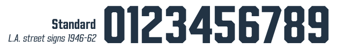
The third big source of inspiration for Beachwood came into play when it was nearly finished. I noticed the street sign numbers looked a lot like uniform jersey numbers. Sports is a big part of LA’s history and culture, so I thought, how can I make this the ultimate uniform number font?
Warning: we’re going DEEP INTO THE WEEDS on football uniforms here. So if, like me, you LOVE pictures of old uniforms, we are gonna have some fun! If you don’t, skip to the end where I tell a cute story about how the font got its name.
I collected tons of vintage Rams pix while creating a Fred Gehrke helmet design tribute, and went through them to see if there were any cool tweaks I could incorporate. The more I dug, the more variations I found. The Rams’ numbers changed not only when they updated designs, but from year to year, and sometimes from player to player!
I decided to leave the street sign numbers as-is, and create sets of alternates for the main eras of Ram uniforms (but only the first time they were in LA, from 1946-94; the dishwater-gray-plastic-number abominations they wear now do not count) and the Raiders during their LA stint from 1982-94.
Set One: Rams 1946-63
The 1940s Rams had yellow jerseys with blue numbers and stripes. I dug the distinctive #1 with its square top hook. Sometimes the #4 and #7 had a serif on the bottom, sometimes they didn’t…
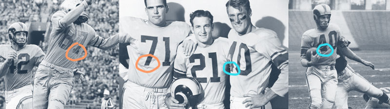
In 1950, the Rams became the first pro football team to have all of its games televised. Blue and yellow contrast beautifully in person, but not very well in black and white. And that was a problem on black & white TVs.
First they added a white outline to the numbers, then in 1957 reversed their colors, to dark blue jerseys with yellow numbers. The Rams were the first to add numbers to their sleeves, to help TV announcers tell who was who. These became known as “TV numbers”.

Set Two: Rams 1964-72
Pro football grew in popularity in the 1960s, due in large part to how great it translated to TV. In 1964, the Rams dropped yellow to go with just blue and white. This combo looked great in black & white, but I think there’s something inherently wrong about those horns being white instead of yellow! Fortunately the change didn’t stick.
The new unis had number issues from the get-go: here’s their feared defensive line, the “Fearsome Foursome”, looking very fearsome in white jerseys, and… a bit less fearsome in blue:
The white jersey #4 and #7 are serif-free, while the blue have serifs. And the white jersey retained the straight across #5, while the blue added a little “knuckle” at the corner. What the heck?
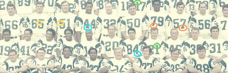
By 1969, the team was sporting all kinds of numbers on their white jerseys: square-hooked #1s & beveled #1s (circled in green), serif and non-serif #4s & #7s (blue & orange), straight #5s and knuckle #5s (yellow).
My best guess is that different uniform manufacturers used different number templates, and as the years went by, some players wore jerseys from previous seasons while new players got different styles, until the Rams were an absolute NUMBERING DISASTER.
Is it just me, or do these guys look like they’re not even on the same team?
Just me? Okay, moving on…

Set Three: Rams 1973-94
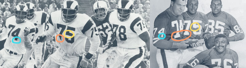
When color TVs gained popularity in the 1970s, the Rams changed back to blue and yellow, with the insanely brilliant addition of ram horns as shoulder stripes! Initially, they had an outline on the numbers, but removed it only a few games into the season when TV announcers complained they couldn’t see them. Those TV announcers, they’re never satisfied.
The initial design kept the straight-across #2 and knuckled #5 from the previous blue jerseys. The next year they switched to an angled #2 and bevel-cornered #5, which stayed in place all the way through their move to St. Louis in 1995 and first Super Bowl victory in 1999.
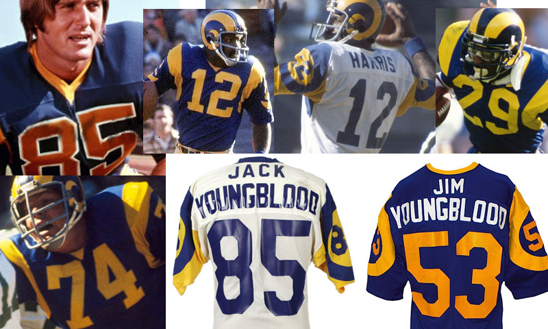
This era also featured one of the first uniform anomalies I remember noticing as a kid: the first names on the back for Jim & Jack Youngblood!

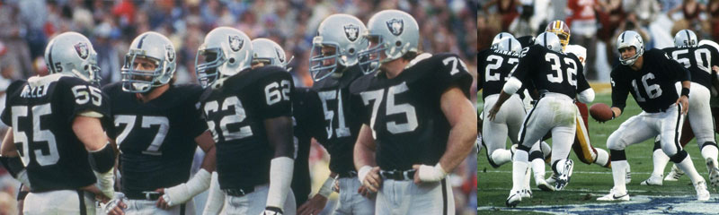
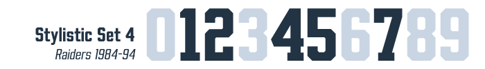
Set Four: Raiders 1982-94
The Raiders’ uniforms are some of the longest-tenured in all of sports, remaining nearly identical to their 1963 debut. Even the numbers are unchanged — the only exception were beveled, knuckled and straight-across #5s appearing in the ’60s and ’70s (again, probably a manufacturer difference).
They’d settled on straight #5 by the time the team moved to LA in 1982, and Jim Plunkett, Marcus Allen & co. demolished Washington in the 1983 Super Bowl. Little on their uniforms has changed since. You can’t improve perfection!
Growing up in the San Francisco Bay Area, the Oakland Raiders were my favorite team. I identified with the ragtag band of misfits and castoffs — led by the firey John Madden and cool Kenny “Snake” Stabler — that somehow managed to come together on Sundays and win far more games than they lost. Usually in exciting, last-second fashion.
Unlike a lot of Bay Areans, I didn’t mind when the Raiders moved to LA in 1982, because LA sounded a lot more fun to me, too. In 1988, I was accepted to UCLA, and off I went.
Set Five: Hollywood Mode
The first day of sophomore year, I met a hot little number named Starshine, who was playing maracas in her boyfriend’s band. An LA native, she turned out to be way smarter and more grounded than the hippie-ish name suggested.
A year or two later, I somehow managed to convince her I was similarly intriguing. On an early date, we went to Hollywood to hit the thrift stores on Melrose. She made an unexpected turn, to take me to the street where she grew up: Beachwood Drive.
Starshine’s childhood didn’t sound all that different from mine — skating on the sidewalks after school (roller skates vs. skateboards, but we could get past that), and going to the gas station mini-mart with friends to buy slurpees & candy.
But then again, rock star Meat Loaf lived next door, ex-Monkee Davy Jones was across the street, and the aspiring singer who babysat when her mom waitressed late nights at the Roxy was none other than Linda Ronstadt.
And most extraordinarily, looking up from that little apartment building, was an absolutely perfect, straight-on view of the iconic Hollywood sign:
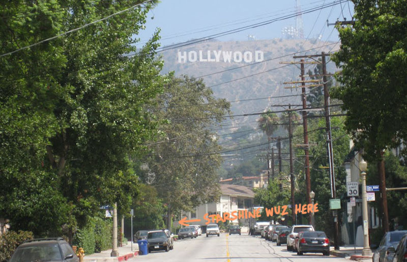
Researching LA street signs, and noticing their similarity to the Hollywood sign, reminded me of Beachwood Drive. Beachwood turned out to be the perfect name for the font, so the final feature had to be:

As for Starshine, she was cute, funny, smart… and her parents had season tickets to the Raiders! I’d found the perfect woman.
And thirty years, two kids and three dogs later, I’m still enjoying the ride.
Beachwood is available now at Fontspring.com.
For more on accessing Opentype features in Illustrator, Photoshop and Indesign, check out their handy guide.