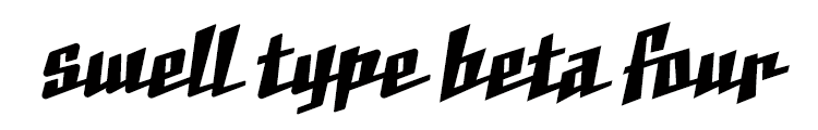
Connected script fonts are always tough, so I saved this one for later in the week!
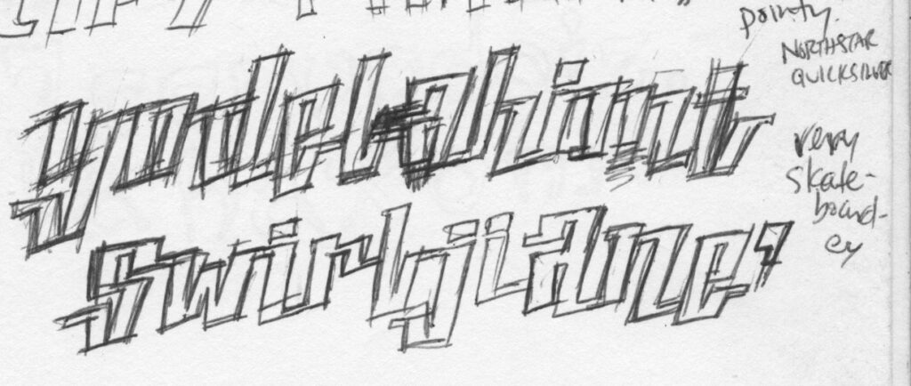
It started with this pair of sketches I drew years apart, with a similar thick/thin connected look.
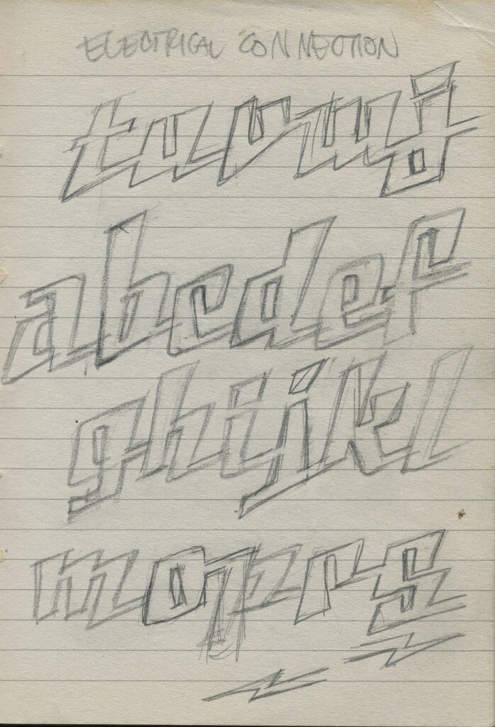
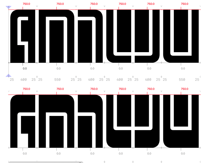
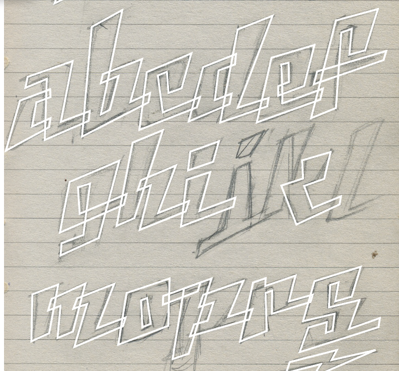
- The alphabet was pretty well developed in the sketch, so I traced ’em all in Illustrator:
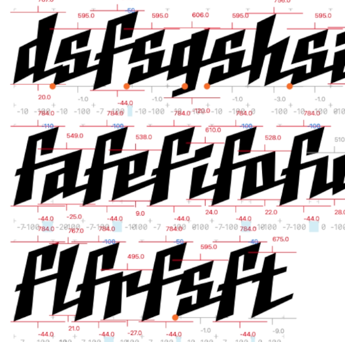
2. getting them scaled and aligned with each other in Glyphs:
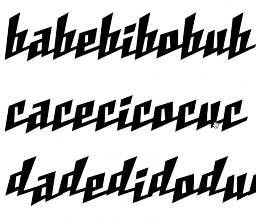
3. working to make all the connector combos…connect:
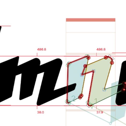
4. and softening the corners:
The finished font has lowercase only, but you get both the “Soft” and “Sharp” versions — that’s two for the price of none! And both have a bunch of custom connecting letter pairs; see if you can spot ’em.