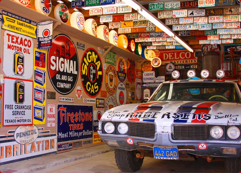
Five years ago I had the mind-bending experience of visiting the Mendenhall Museum in Buellton, an incredible collection of road signs and other car memorabilia. It sits only about 45 minutes north of me, but it felt like a time machine that took me back 70 years:
I was especially fascinated by these road signs, which I’d never seen before. The lettering is a really simple block style, but stretched and squeezed into crazy widths and weights:
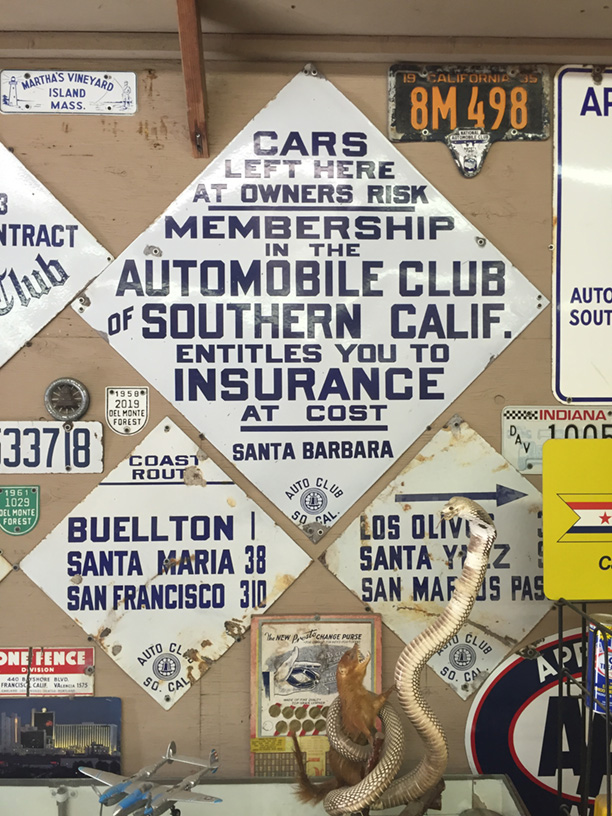
Turns out that 100 years ago, when cars were a new phenomenon and most of the roads unmarked, regional Auto Clubs formed to publish maps and post signs to help drivers find their way around. Then in the 1940s the U.S. Dept. of Public Works took over road signage, and these delightfully idiosyncratic local signs were all replaced.
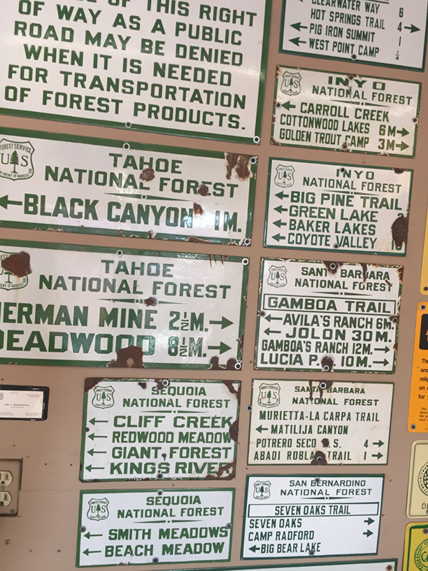
The lettering on these had a certain rigid logic to it, while simultaneously seeming random and weirdly expressive. They are much wilder and more interesting than anything we see on roads today! I loved them, and immediately imagined making a font family with all of the widths and weights.
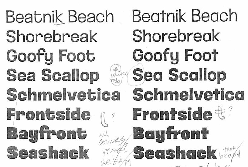
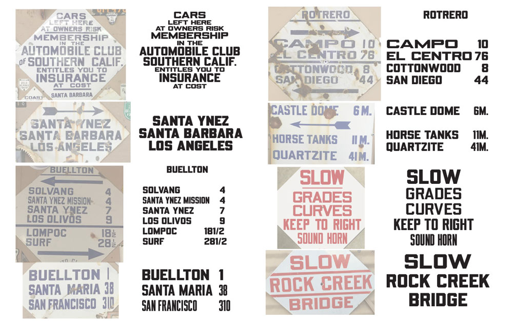
Then last summer I created the alphabet of big, beveled letters for the high school sign project, and realized I had the perfect start to that road sign font. I completed the uppercase alphabet in regular and bold, then made ultra wide and narrow versions, and exported a variable font that could stretch and size to match the lettering on the signs:
It was coming along, but there were many more ideas in my “blocky beveled” folder that had to be explored…
When I lived in Los Angeles, I found it baffling that there were two distinct styles of white and blue street signs in the city, often on the same corner. It was as if a new style of sign had replaced the older, but they hadn’t bothered take the old ones down:
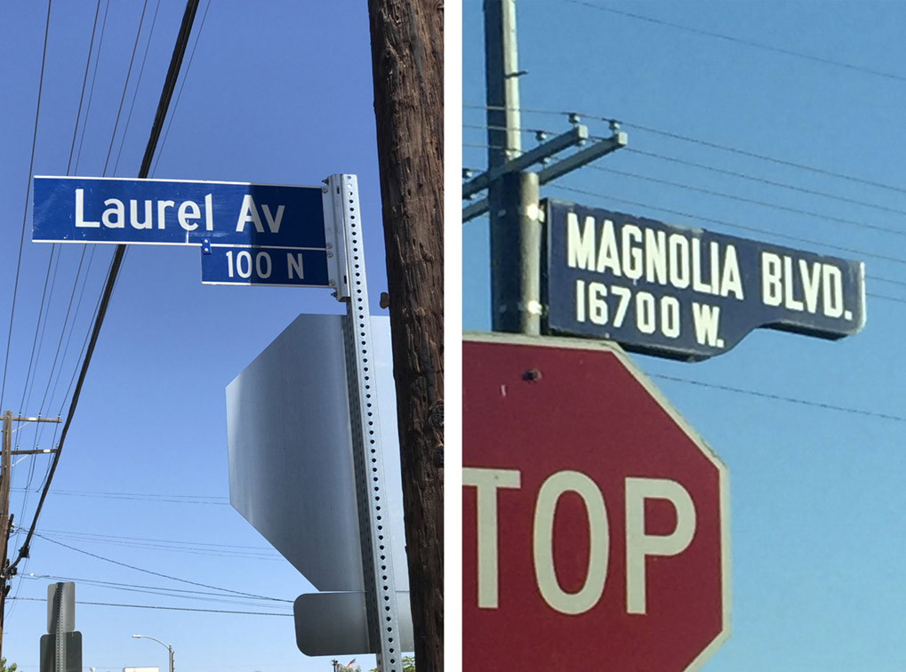
The older, all-caps style was FAR cooler. I figured they could be gone at any moment, so I took a lot of pictures, trying to capture the different letter widths.
Turns out there are other fans of these signs, who have nicknamed them “shotgun style” based on the shape, or “bird nest” because birds like to build nests between the panels. These signs were produced for less than twenty years (1946-62) but are so durable they have stayed in use.
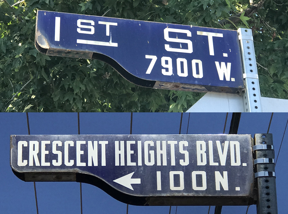
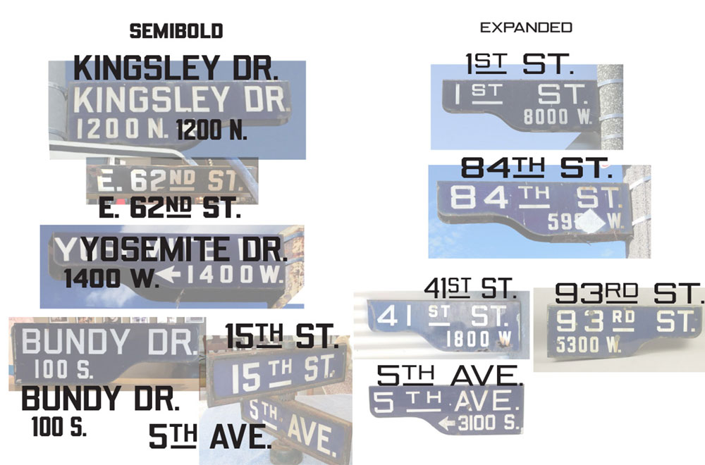
I also learned that the metal sign blades were manufactured in just one size, so lettering had to be squeezed and stretched to fit the different street names. I did the same process, matching my font to pictures I’d collected…
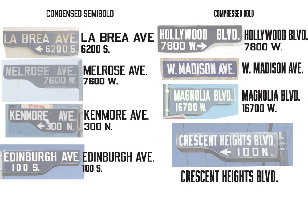
Like the Auto Club signs, these were drawn in a wide range of widths & weights, but were more consistently standard. This helped me figure out the preset widths & weights for the font. I also couldn’t resist adding all of the cool little “TH” “ST” contractions and arrows!
The letters also remind me of the famous Hollywood sign, built in 1923. I have not been able to find out if these signs were an homage or not.
But that connection did lead me to a name for the font.
More to come…!