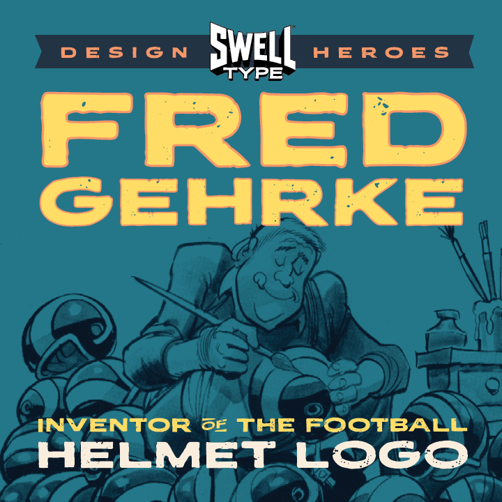
Goodland font development

A new year in the Goodland

Lately I’ve been on an epic fontsploration of the signs, letters & historic type of Goleta, the community just north of Santa Barbara, for a font I’ve been wanting to make since long before I started Swell Type. Way back in 2008, I snapped these pictures of some wonderful painted block lettering on the side […]

Read More

Catching the Silver Streak

As my latest font, Silver Streak, nears release, I wanted to catch you up on my progress, and share some of the process that went into making it. This one started with a single bit of inspiration — this nifty lettering on the side of the “Silver Platter” diner & gift shop at Disneyland’s California […]

Read More

Getting to Paradise Point

Paradise Point was birthed from the single-weight Pleasure Point I designed for Comicraft back in 2014. This was another font (like Hyperspace Race) that I always wanted to make more fun and extensive, with wides and bolds and extra features and such. And it’s finally here! My first step was stretching and pulling the tall […]

Read More