Paradise Point was birthed from the single-weight Pleasure Point I designed for Comicraft back in 2014. This was another font (like Hyperspace Race) that I always wanted to make more fun and extensive, with wides and bolds and extra features and such. And it’s finally here!
My first step was stretching and pulling the tall and condensed Pleasure Point into a wide version:
A neat thing about Glyphs is once I’ve create the two extremes of a letter (such as narrow and wide), if the points correspond, Glyphs will calculate the in-between versions. Here I created the tall and wide S’s, and it generated the center one.
Of course, it’s not always that easy. More on that later…
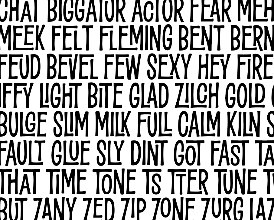
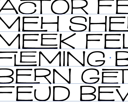
Since these letters had kind of an island vibe, I started playing around with interlocking letter combos, Enchanted-Tiki-Tiki-Tiki-Room style!
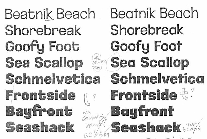
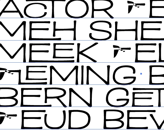
The tall, condensed weights worked great, but the heavy & wide version presented problems…
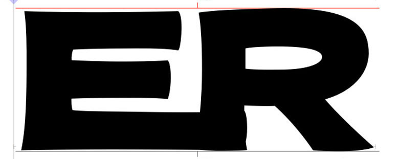
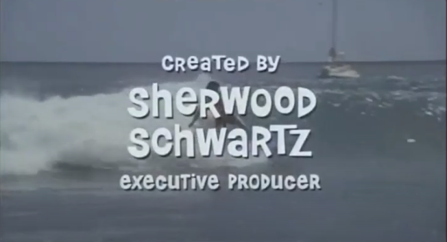
How can I shorten the leg of the R without it looking like some strange, non-R letter? The Tiki gods were clearly unhappy. To appease them, I ate Dole Whip while watching old Brady Bunch episodes. The whip was good. The show, ouch… not so much. (Do love those letters, though!)
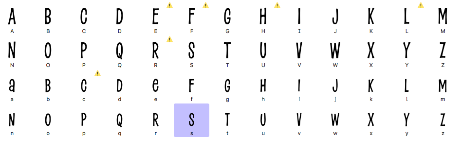
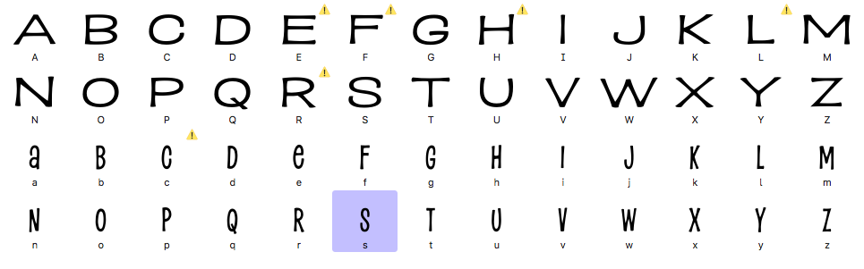
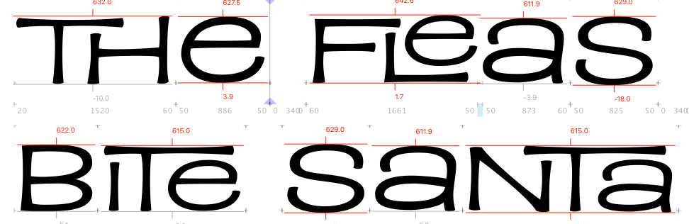
Eventually I realized that the versions with lowercase a and e were more fun and playful, so I deleted the uppercase and went with these:
Now back to Variable fonts — this is a relatively new technology that allows you (or rather, me) to create the extremes of a letter (on an “axis” such as width, weight, italic, etc), and then you (yes, you this time) can use any increment between!
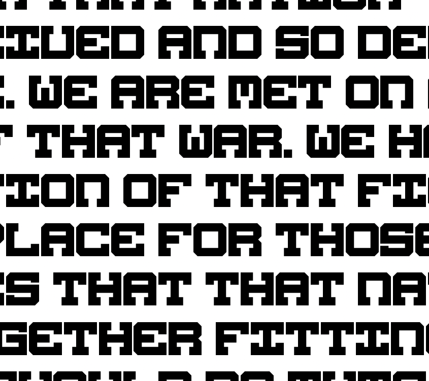
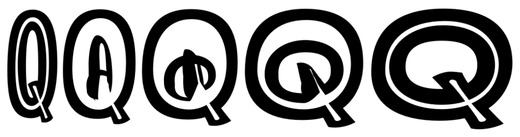
Some letters work fine right away, but others have weird interpolation problems, like these twisted and distorted Fs:
Or this Q. Though the effect is kind of cool…. at some point I’m sure I’ll find a use for it.
To get a functioning Variable Font, I have to painstakingly go through the font to make sure every corresponding letter has the same number of points and handles on each curve, and each path starts counting at the same point on the letter. Oh, yes, it is most definitely a PITA. But I do it for you. And for the Dole Whip.
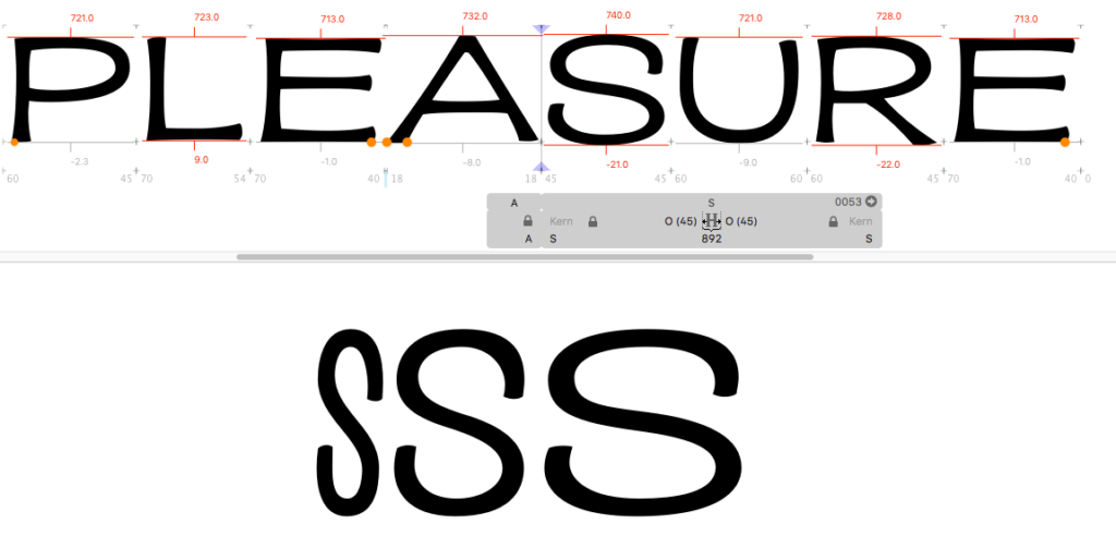
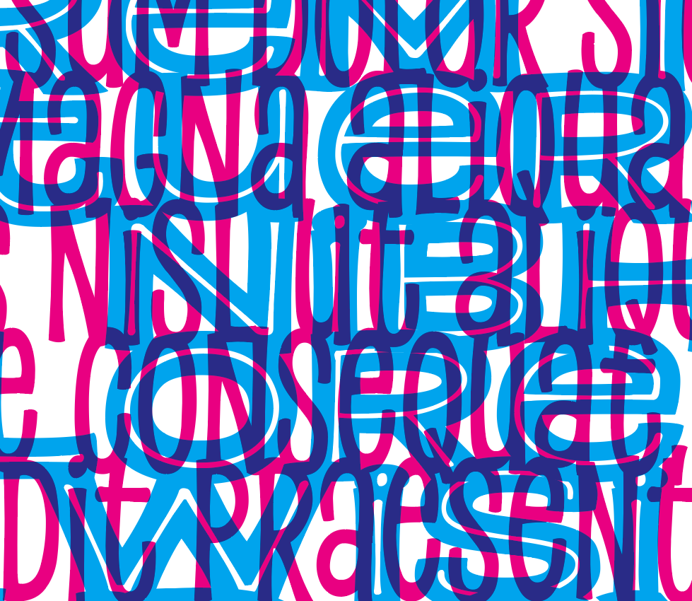
One of my final tests was to make sure the heavy and inline weights overlapped exactly right for creating layered color effects. I like to set one to cyan, the other to magenta, and both to “Multiply” so the colors combine like layers of ink on a woodblock print.
Once again, even the slightest miscalculation will cause everything to go completely haywire:
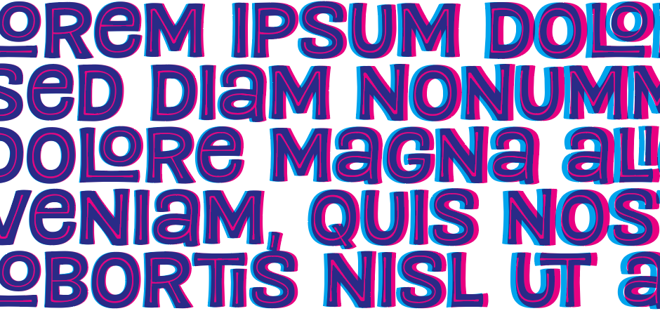
Though again the accidents can also be really cool, like this combo of Compressed Regular (pink) over Extended Heavy Inline (blue):
After repeating this process another, oh… 24 times, and programming the 100+ interlocking letter substitutions, all that remained was to choose a name. What’s better than Pleasure Point… Paradise Point! That part, at least, was easy.
— John