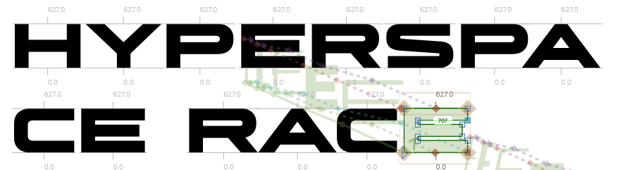
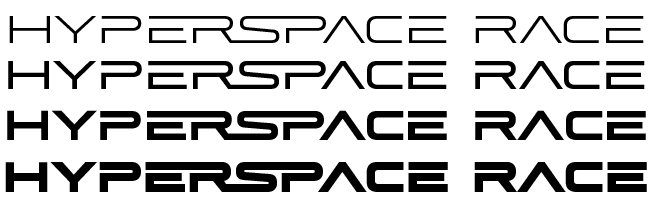
I just published my first release for SWELL TYPE, Hyperspace Race! It got its start as part of Marvel Strike Force. After I created Ultimatum for the game graphics, they asked for a simpler, more readable version for larger blocks of text, which Comicraft eventually released as Space Race.
There are usually leftovers when I create a font — trials and errors that sometimes get repurposed, but more often are left in the folders to gather digital dust. With Space Race, the leftovers were in my head. As I was working those letterforms, I imagined so much more I could do with them. So when I had time late last year, I started messing around — how wide and skinny could I make the letters?
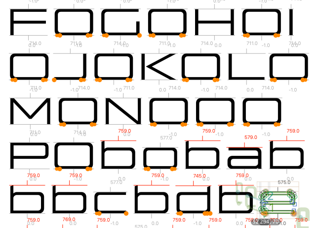
And how bold? Already, the results were looking good!
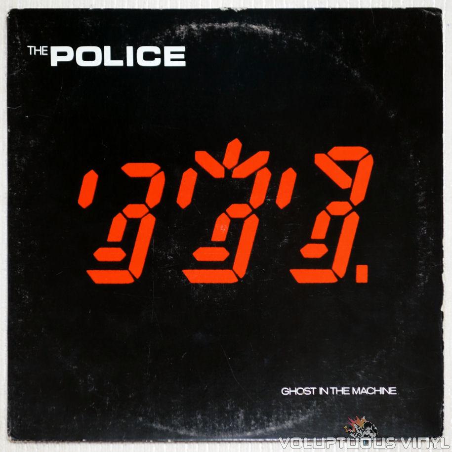
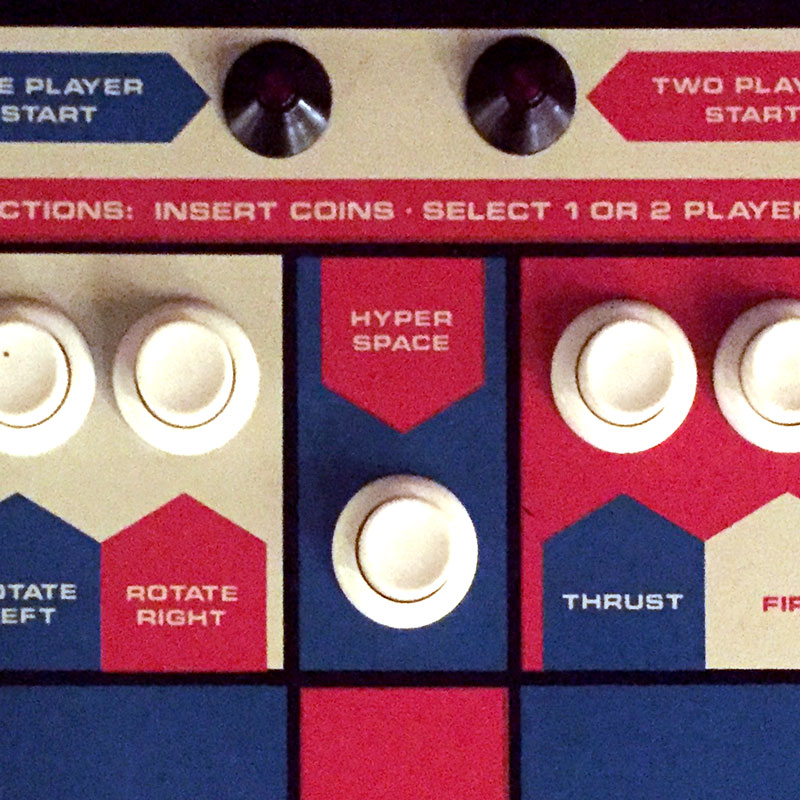
As it came together, I started seeing similarities to fonts I’d loved growing up. The ultra-wide-and-bold is, OK, just a WEE bit like Eurostile (aka Microgramma), which was the first set of letters I’d recognized as a kid in different places — from my favorite band’s album covers, to the Asteroids control panel…
…to logos in my favorite movies. (Eurostile has appeared so often as the “font of the future” in movies that somebody wrote a whole book about it. Great read for font nerds!)
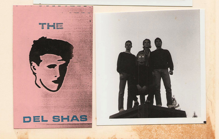
Eurostile was also the first font I ever got to USE, in the form of Letraset rub-on letters I found at the art supply store and then put on my OWN band’s stickers and album covers.
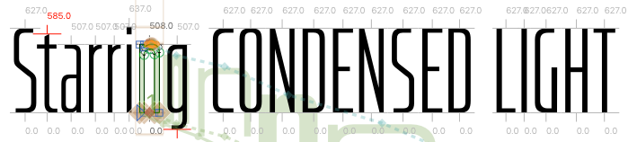
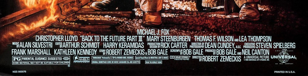
Then I noticed the ultra-light ultra-condensed was looking a bit like Univers Condensed, which is best known as the font from the credits at the bottom of movie posters:
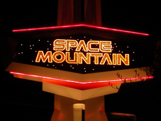
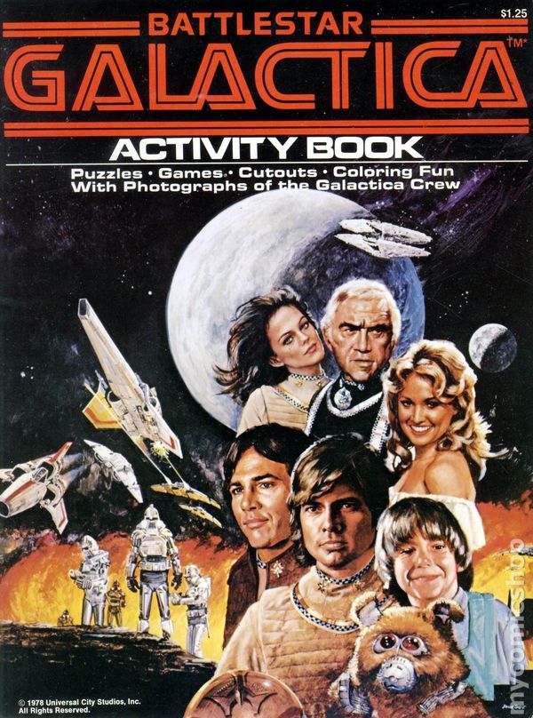
And more influences hit me, like Space Mountain, Battlestar Galactica…
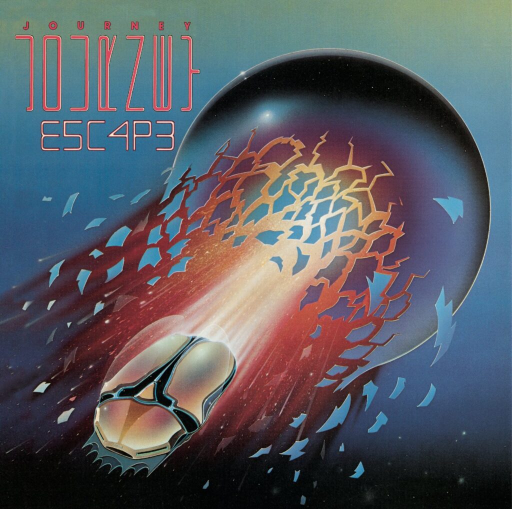
…and the logo on Journey’s ESCAPE album, with those super-skinny letters turned on their side that my friend and I stared at for hours trying to decipher (we did finally get it; let me know if you need help), along with the first time I remember seeing numbers in place of letters (now known as LEET) — it was type as art, as secret code, and it was SO cool. Even cooler than Journey itself. 🙂
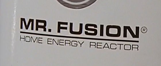
That’s when it hit me — GREAT SCOTT! I could make the ultimate ultra-tall-and-skinny, ultra-wide-and-bold sci-fi font, with every weight and width between!
ONE FONT TO RULE THEM ALL!
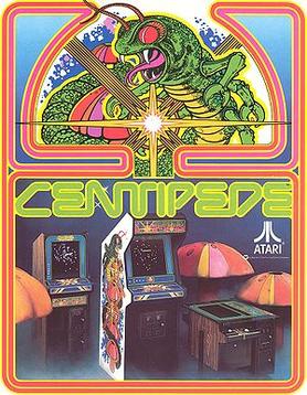
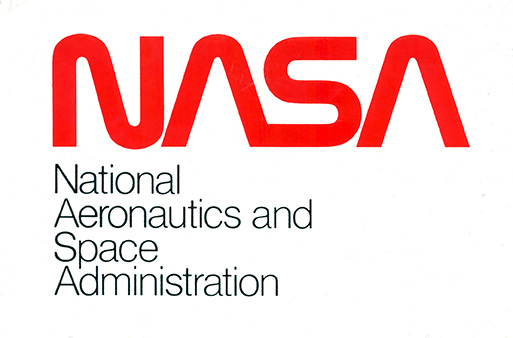
If it was going to be the ULTIMATE sci-fi font, well then certain letters would have to connect, like Star Wars and Centipede and NASA…
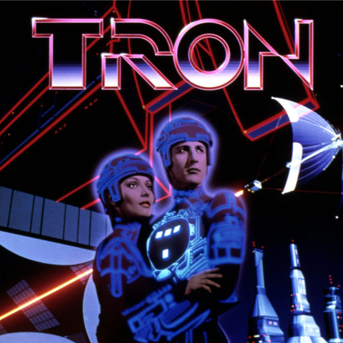
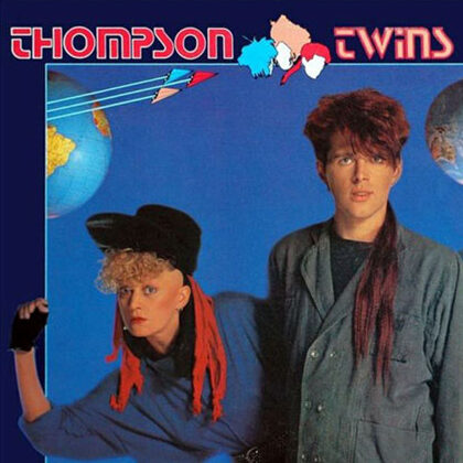
…and there would have to be strategic gaps and slices like Blade Runner and Tron and the Thompson Twins…
This was quickly spiraling out of control. I wanted this font to have all of these cool features, while also being functional and versatile — to look awesome at big sizes in logos and headlines, but also be readable in large blocks of text at small sizes.
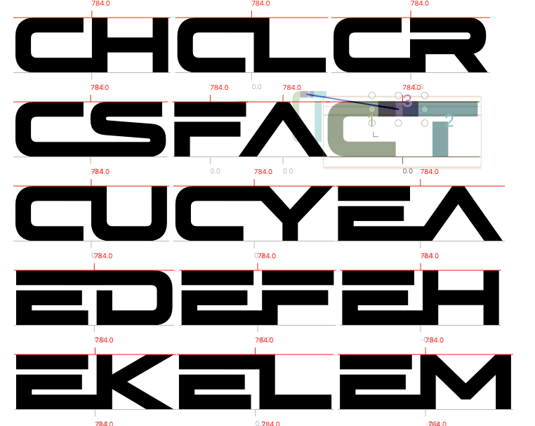
In contrast with the quick start, getting all of these weights and widths to work together, and the connectors to line up, and the variable controls to work without letters colliding and parts flying off… it sometimes felt like I was going back in time instead of forward.
In the end, Hyperspace Race became the most ambitious, complicated font I’ve ever attempted. It was also a lot of fun, and I’m really proud of the result: It has connecting letters! Eight weights in five widths! And a nifty variable font that lets you choose any width, weight or angle between! It’s all over my new website, including this text, so if you’ve read this far, hopefully you’re digging it, too.
When I was a kid, I would wonder, “who designed these letters? How do other people get ahold of them and use them?” Now I’M someone who makes them, and other people get to use them, and that makes me infinitely happy.
— JR