This font started out exactly a year ago as a “proof of concept” — a font I built just to see if it could be done. The initial test told me yes! But since then, it’s proven nearly impossible to finish. Every time I hit a wall, I’d put it aside and work on something else. But it kept calling me back, and as it nears completion at LONG last, I wanted to share some of the inspiration and process.
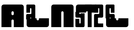
The idea came when this fantastic Instagram account BWHAM I follow started showing comic letterer John Workman’s incredible sound effects and titles from 1980s THOR comics.
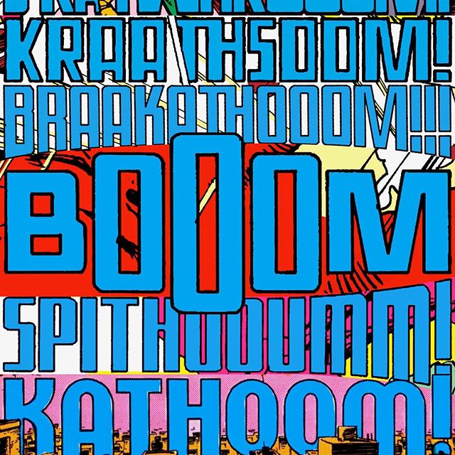
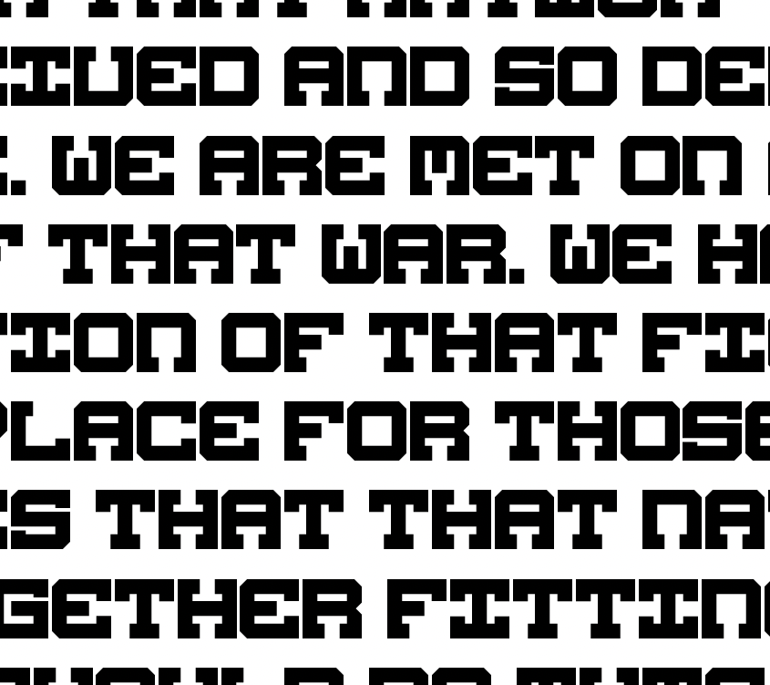
Workman has a unique approach to FX — they’re very rigid and geometric, the letters stretch from tall to wide, and he varies the contrast wildly between the vertical and horizontal strokes. I thought, something like this might make an incredible Variable Font…. so I spent a few hours building an alphabet, just to see if it would work. And lo, it did:
…for the most part, anyways. 🙂
The surprising treat was that, as I stretched and shifted the letters, it started reminding me of various “futuristic” sci-fi type logos from the ’70s and ’80s, like the SIMON game…

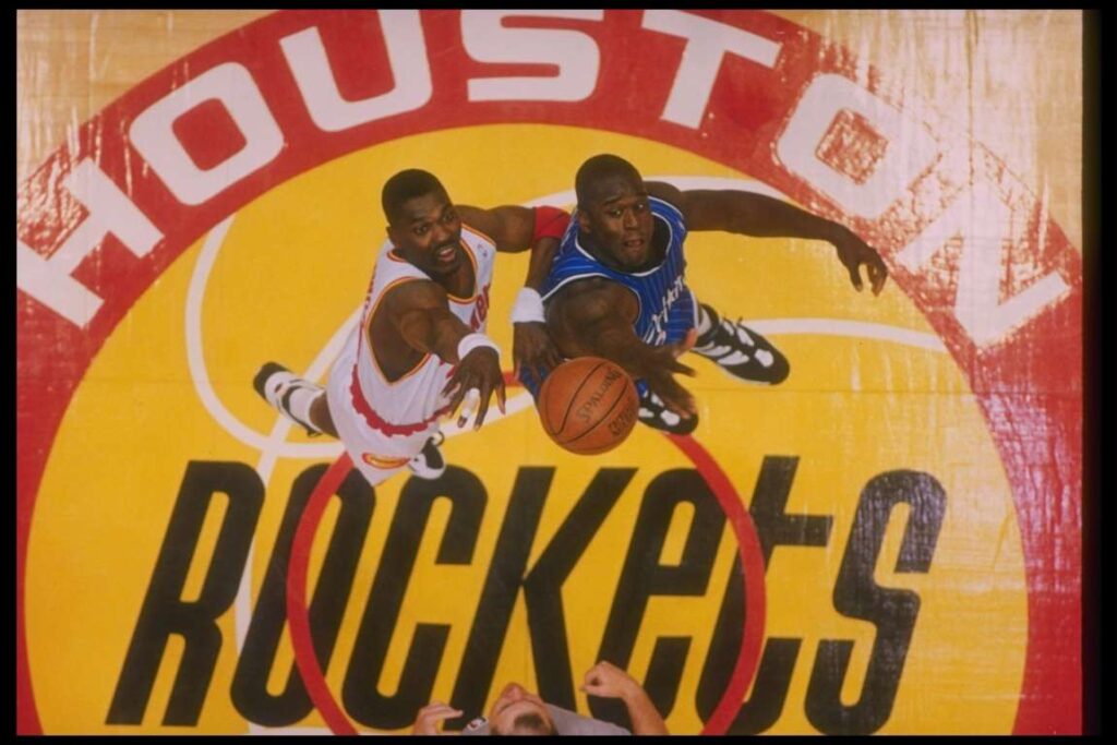
The Houston Rockets…
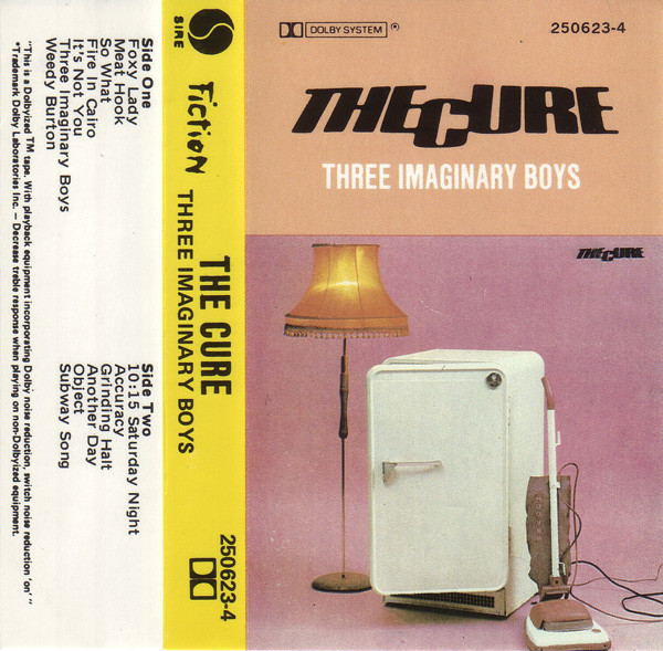
One of my favorite bands…
and was a near-perfect match for my second favorite shoe brand (sorry, Rudi, Adi makes my faves!)
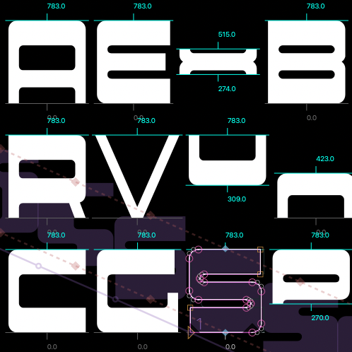
Since many of the letter shapes repeated, I thought it might be best to construct each letter from a handful of “modular” shapes, that would simplify the work required to make the many widths and weights…
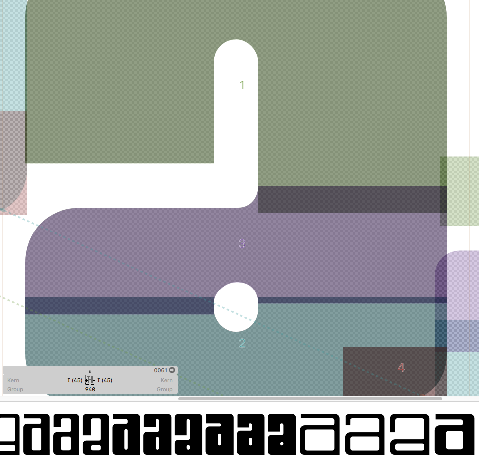
…but that strategy created more problems than it solved. The slightest change to one shape tended to throw everything else off!
The trickiest part was getting the top and bottom “hooks” to appear and disappear based on the letter thicknesses and crossbar position…
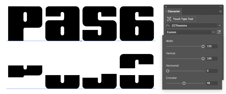
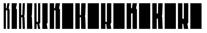
…and getting the K shape to flip its look when the Crossbar passes the midpoint:
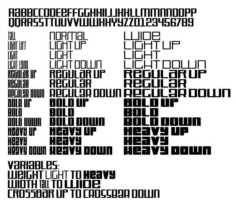
Eventually, the kinks were getting worked out, and the family was taking shape! The number of “presets” within the realm of possible weights and widths quickly added up…
But was that enough? No, dear reader, it was not.
See, as I was completing the accents and special characters for all of those weights, the thought occurred to me: “it should really have a ‘reverse-stress’ option, where the horizontal strokes are thicker than the vertical!” And once I think it, I have to make it. HAVE to, I tell you.
As it neared completion, I faced the toughest part of making any font: choosing the name! Finding one that tells the story of the font AND isn’t already in use can be daunting, and this one also needed something short enough to leave room for the many width & weight names within the max of 32 characters.
At some point in the brainstorming I came up with JETLAB, which I think perfectly captures the high tech space race optimism of the ’60s and ’70s. And it pays tribute to the Jet Propulsion Laboratory in Pasadena CA, which recently conquered the seemingly impossible challenge of building a helicopter that flies on Mars!
Yeah. If they can do that, I can finish this font.