Helvetica is the font I associate with family trips to San Francisco in the ’70s and ’80s.
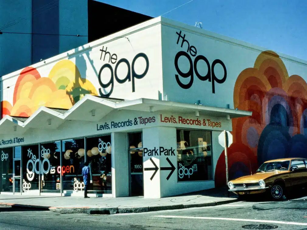
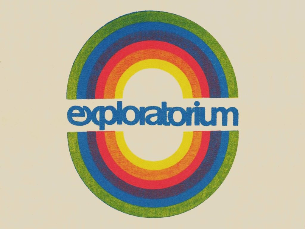
As my little geek brain was becoming attuned to fonts and signs, Helvetica was one of the first fonts I recognized, on generic shopping center signs, the big painted text on the GAP store at the corner of Ocean & Fairfield, and the funkily modified use in the Exploratorium (one of my favorite stops!).
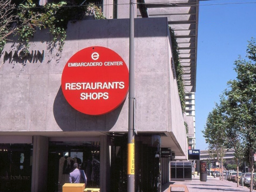
Something about it was generic & featureless, yet also had a certain cool, detached “modern” feeling. Like other fonts were of the past, and this was the font of “now”.
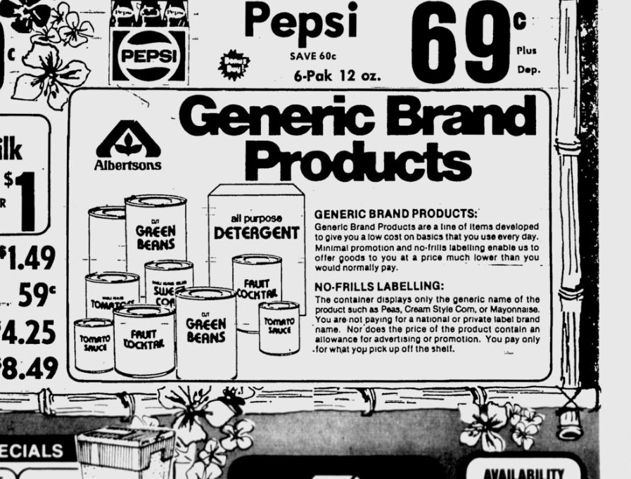
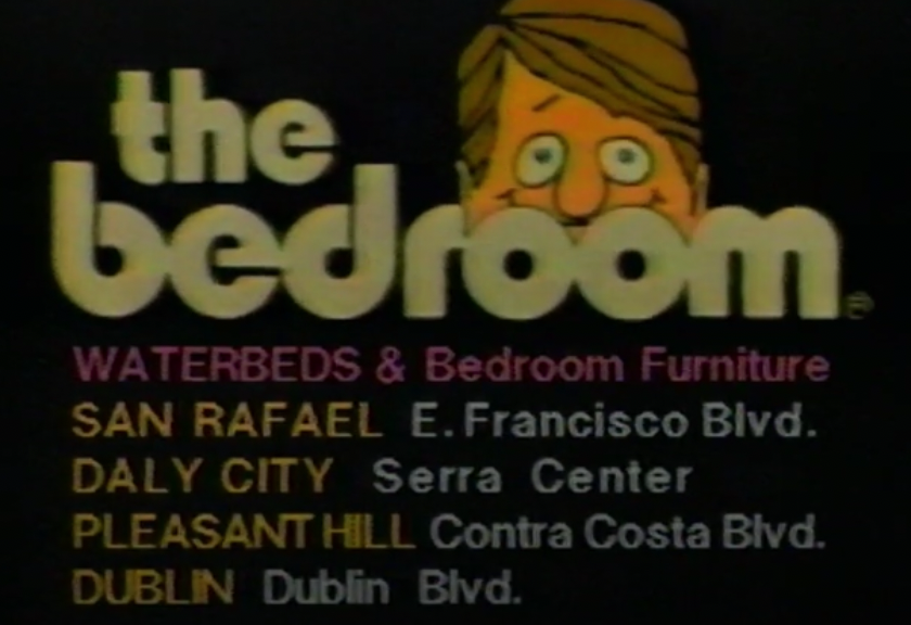
I started noticing it everywhere, like newspaper and TV ads:
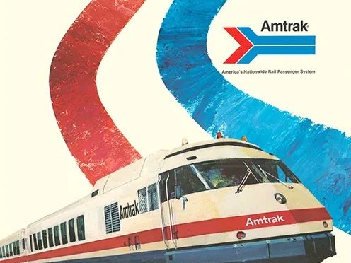
Helvetica made me think Amtrak trains and samTrans buses were the same company:
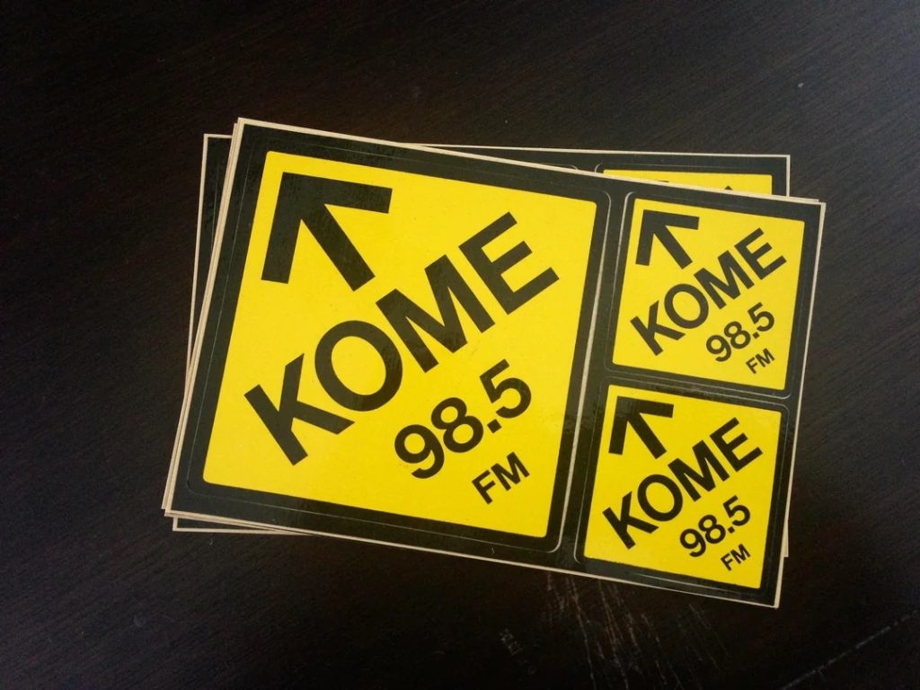
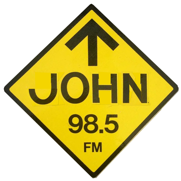
And some of my earliest “font designing” was grabbing stacks of these KOME radio station stickers at record stores, then cutting & combining pieces of the Helvetica letters to spell my & my friends’ names.
Because of the horizontally sliced ends of letters like c, s and e, I thought the “Home” magazine logo from the Sunday paper and “rocket jets” poster at Disneyland must be Helvetica, too…
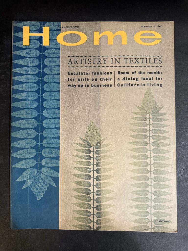
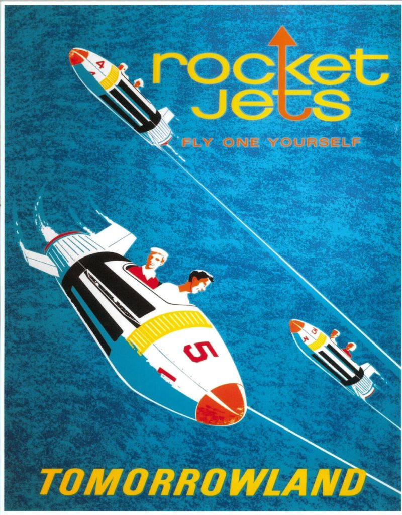
…but I would soon find out they were far from it.
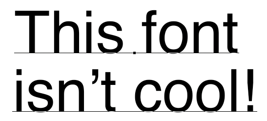
In high school, I started working for a graphic design company and got my hands on a Mac for the first time. I was excited to find Helvetica right there in the font menu for me to use, anytime I liked!
But this wasn’t the font I expected at all. The letter spacing was way too far apart, and the characters lacked… well, character!
I can probably count on one hand the number of times I’ve used digital Helvetica in a design since.
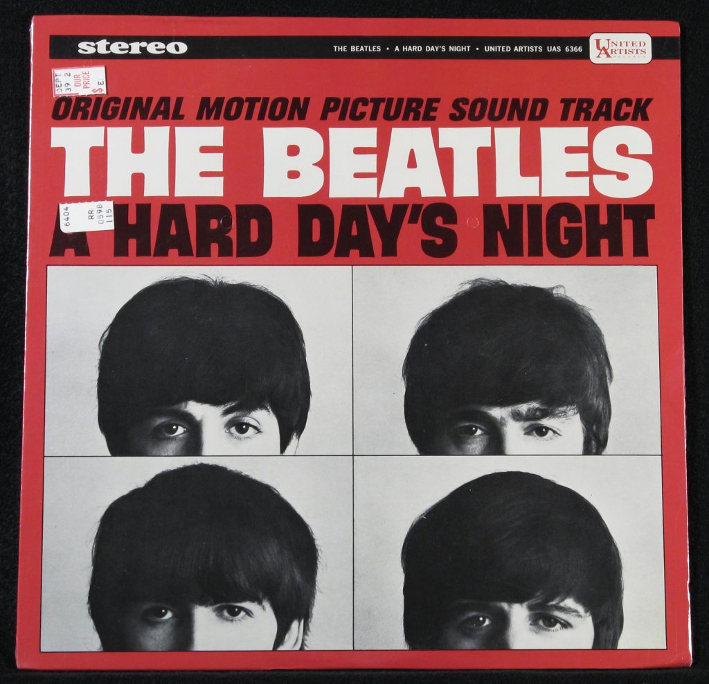
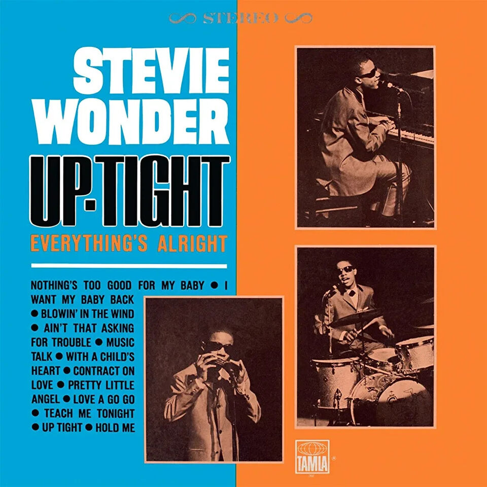
Fast forward a few decades, and I was creating a smoother, thinner version of my Comicraft design Backbeat, originally based on the uppercase lettering on 1960s Beatles & Stevie Wonder albums:
As the new font took shape, I realized it was looking Helvetica-like, but with personality. There was the big, loopy r & t from “rocket jets”:
Without realizing it, I had arrived at the cool Helveticamalgamation that had been in my head all these years!
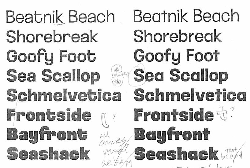
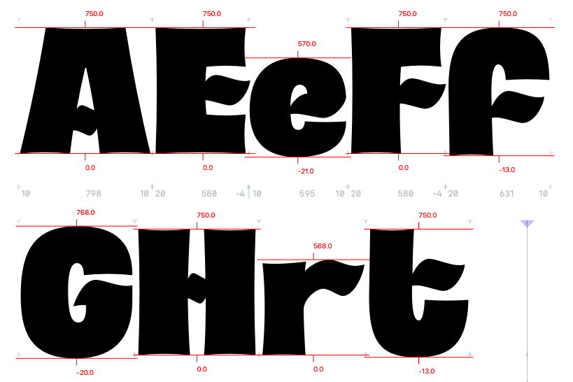
I made the curves in Hellafine nice and round, but rather than straighten the sides and ends, I left them slightly curved and scalloped.
This is a look I associate with painted signs — it comes naturally from the artists pressing a bit harder at the starts and ends of each stroke, and is a deliberate technique to enhance the sharpness of corners:
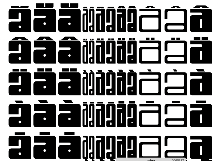
Inspired by the Exploratorium logo, Hellafine has loads of optional (a.k.a “Discretionary”) connecting ligatures:
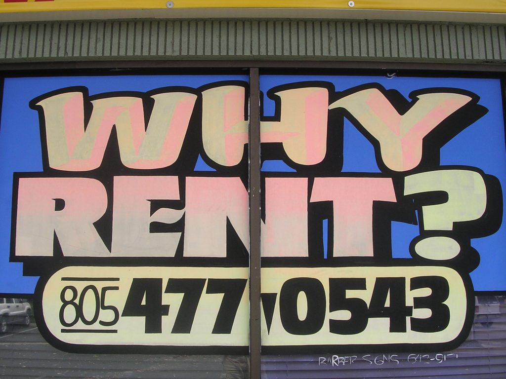
As a nod to sign painters, Hellafine’s alternate Set 2 (“Fancy”) has little wavy crossbars, which I sometimes spot in my favorite California sign painter Nick Barber‘s work:
And Stylistic Set 3 is a very ’70s-ish unicase, with a handful of lowercase-styled letters (like a, e, i and n) in the uppercase, and all of the letters the same height:
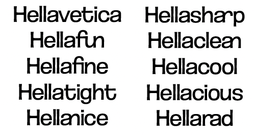
When it came time to name it, putting “Hella” at the front seemed the perfect nod to the SF Bay Area and Helvetica.
My Oakland friends who advised me in choosing the name want you to know that “Hella” comes from the East Bay, not San Francisco. I’m a South Bay dork, guys — what do I know?