The city of Santa Barbara put out a call to local artists for original work to adorn State Street storefront windows. As a font creator who spends my days designing letters, I’ve always loved those alphabet grids assembled out of butterfly wings or google maps images. I’ve taken hundreds of pictures of Santa Barbara signs as inspiration for my work — so I made a grid of my favorite letters, and colorized them for cohesion!
- To start, I opened a new Indesign doc, blocked it out in a 6×6 grid and filled it with my top picks:
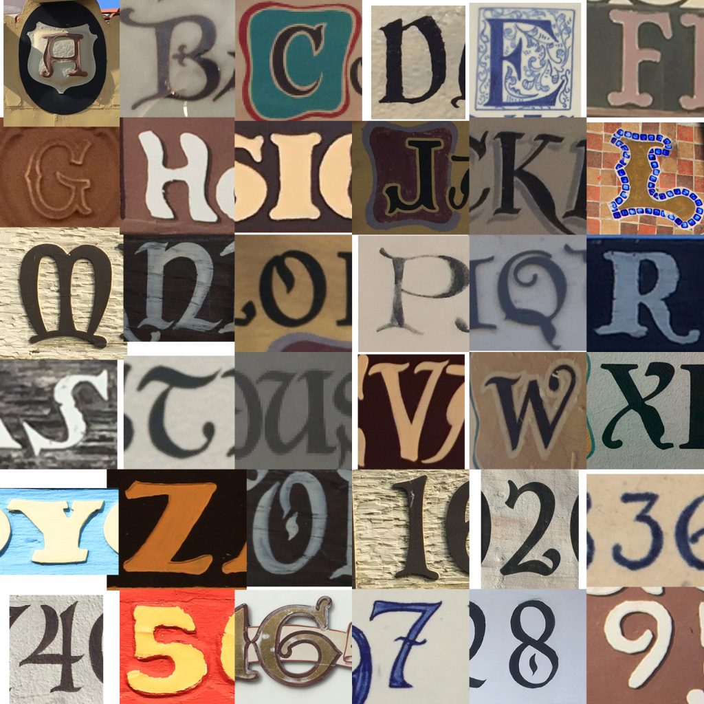
Some were gimmes, like A for the Arlington Theatre and G for Granada Theatre.
As usual, J, Q and Z were tough to find, but for most letters I had way more great letters than I could use.
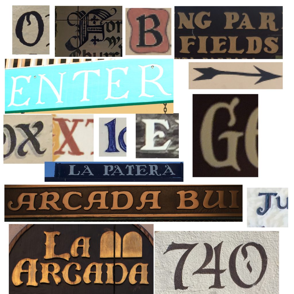
But how to choose? I knew I wanted them all to be hand made, or at least signs that didn’t come from computer fonts.
SB has so many skilled sign painters, each with a distinct spin on the Santa Barbara calligraphy style. Should I use painted letters only?
But the wood, metal and tile ones were cool too, and would give some of the squares depth to make the whole thing more interesting than just flat letters.
Since it was a project for Downtown, I decided that all of the letters should come from Downtown. (One number came from Mission St., but that’s close enough…)
2. After choosing 26 letters and ten numbers, I had to extract letter shapes from the photos into flat art files that could be easily colorized.
One of my favorite Photoshop tricks is to look at the Red, Green and Blue channels of the artwork — this usually brings each of the color elements into sharper contrast than the full color image.
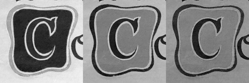
I then saved each element of the letter into individual .tiff files.

Zooming in this close on the letters revealed roughness and imperfections, but I decided that grittiness would be part of the charm.
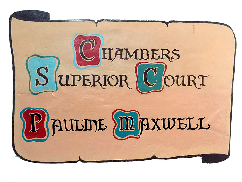
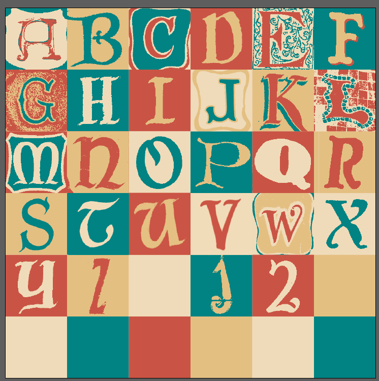
3. Back in Indesign, I created a palette of four colors: sky blue, ocean green, terra cotta red, and sandy beige, and started placing and coloring my extracted letters.
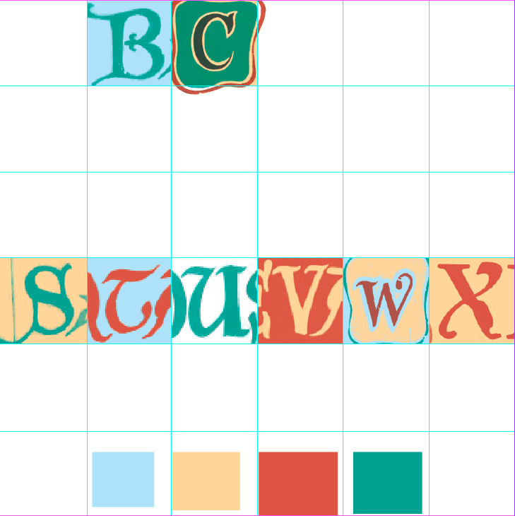
I liked seeing the bits of cropped off letters in each square, but my wife thought it was confusing, and the alphabet concept might not be clear to non-lettering geeks.
We also disagreed what “Terra Cotta” and “Santa Barbara Teal” look like, until she finally said, “isn’t there some kind of official guide to Santa Barbara colors?”
I thought “no,” but turned out yes!
4. I adjusted my green and terra cotta to match colors in the guide. There was no sky blue, but so many white & tan shades, I thought maybe an off-white “adobe” would be a good replacement.
To help choose the background colors, I cycled squares of the four colors through the grid:
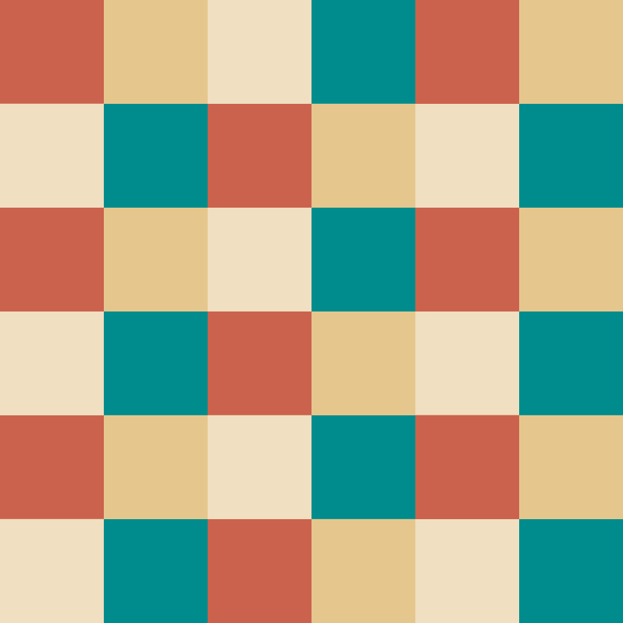
And then placed letters over the top.
The most fun squares were the multi-layer ones like A, C and L. The darker “sand” looked great as a shadow over the lighter “adobe”.
5. As the grid took shape, I decided to alternate off-white and sand in every other square like a checkerboard. I think that pattern over the cycle of six background colors gives the whole thing rhythm without looking repetitive.
I also let a couple of the letters push beyond their squares to blend with the letters next to them.
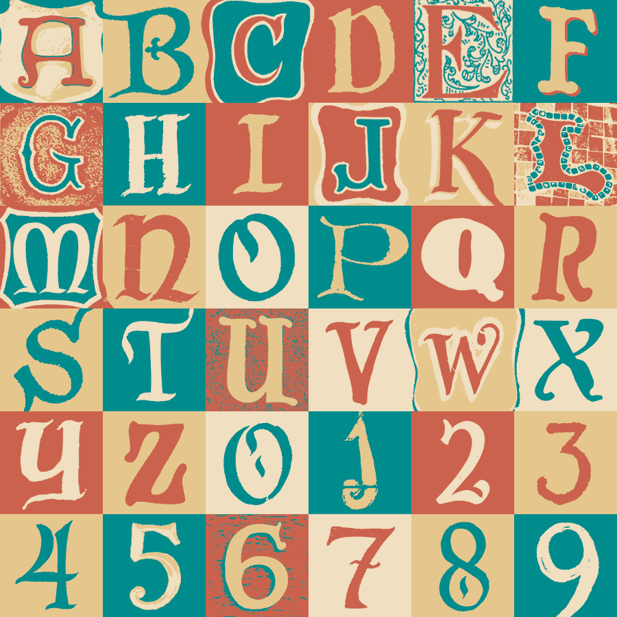
The finished piece. Santa Barbarians, can you find ’em all?
Additional photography: Forest Dempsey
Sign painters (identified): White Signs, Pablo Blanco