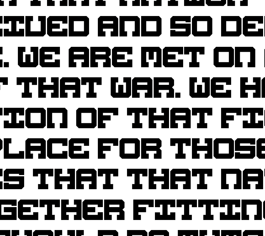
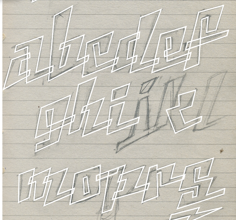
As my latest font, Silver Streak, nears release, I wanted to catch you up on my progress, and share some of the process that went into making it.
This one started with a single bit of inspiration — this nifty lettering on the side of the “Silver Platter” diner & gift shop at Disneyland’s California Adventure. I loved the squarish look of the letters, and thought it was a unique take on the thick/thin Art Deco style, that I hadn’t seen anywhere else.
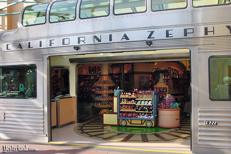
You may say this is a pretty lame source of inspiration, but frankly, Disney does an awesome job on the lettering in their parks, and, in my twisted mind at least, it adds a lot to making the rides and lands feel unique and authentic.
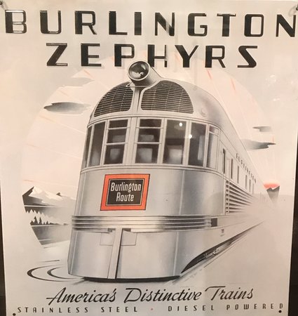
A little digging revealed that this lettering was not only period-accurate, but that they’d used actual old zephyr train cars in the park!
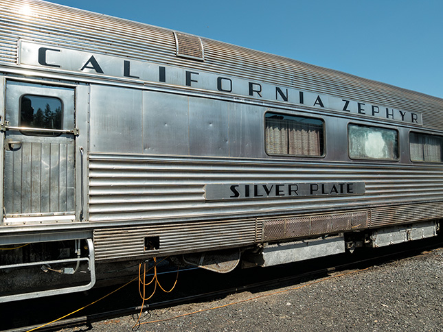
The California Zephyr line ran between Chicago and San Francisco from 1949-1970, and each car had a name that began with “Silver”. Hmmm…
Disneyland overhauled California Adventure in 2011, and where the train shops once sat is sadly now… a Starbucks. Naturally.
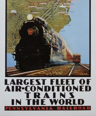
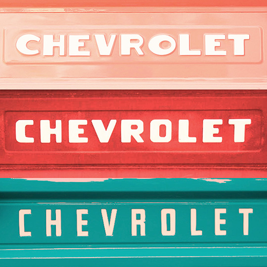
So this piece of inspiration led me to dig through my folders of pictures for other squarish thick/thin lettering that might inform the font. I found posters from a train-themed pizza parlor we often go to…
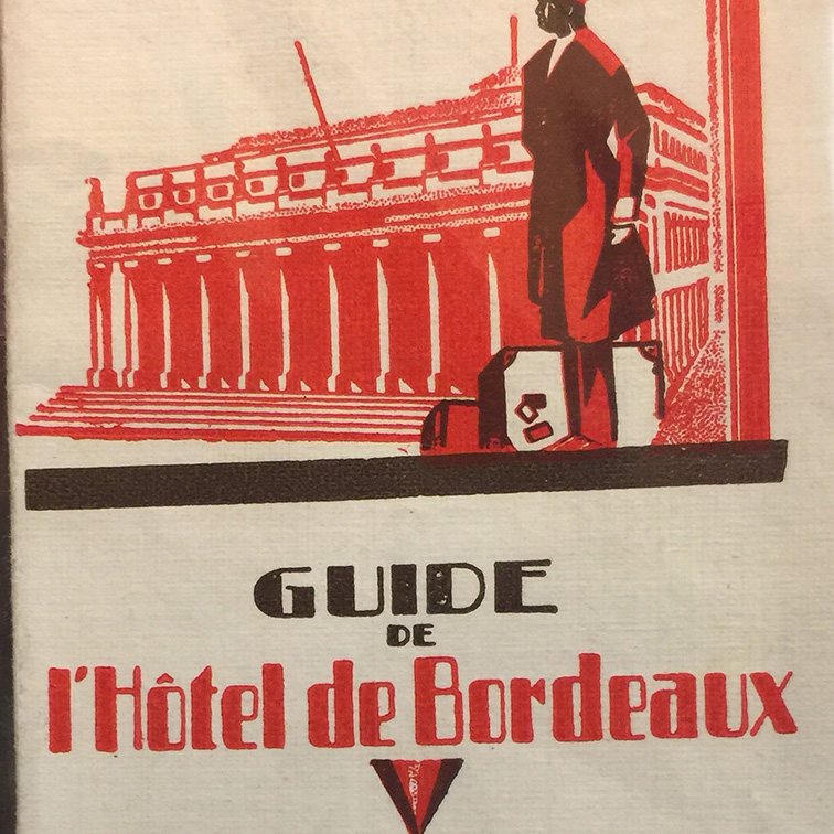
… some nifty thrift store finds…
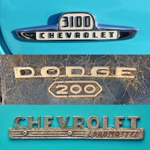
…the stylin’ badges on pickup trucks of the 1930s and 40s…
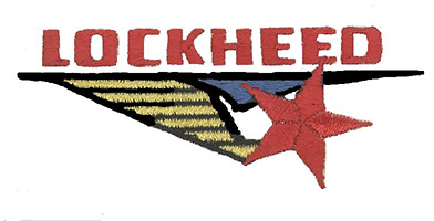
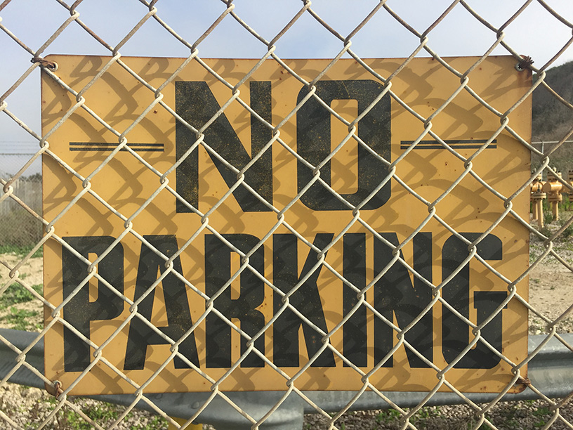
… and in the realm of air travel, this Lockheed logo, and a cool “No Parking” sign on a fence near the Santa Barbara airport (if you’ve seen me getting out of my car to take pictures of random fences, now you know why).
So with a lot of good reference, and the theme of travel and transportation in mind, I started sketching.
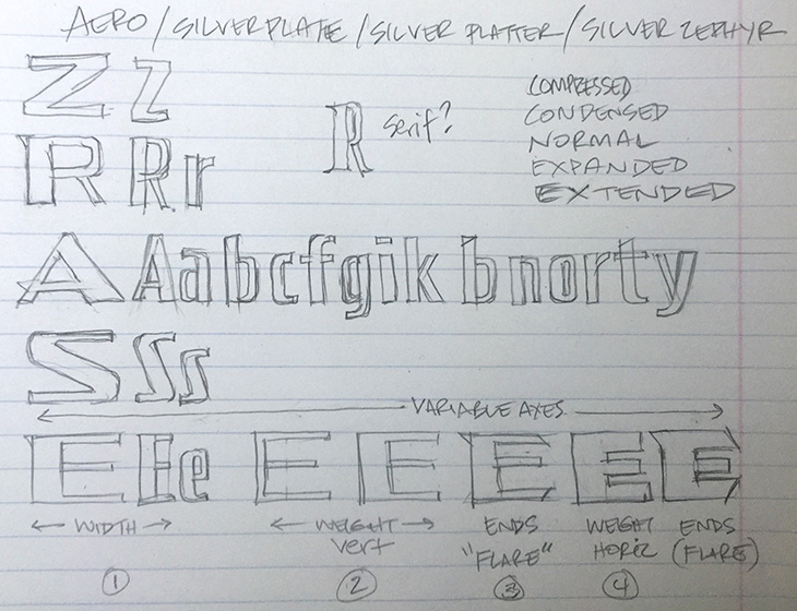
Pretty quickly, I’d mapped out the logic for the letter shapes, as well as how they might progress from narrow to wide and thin to thick.
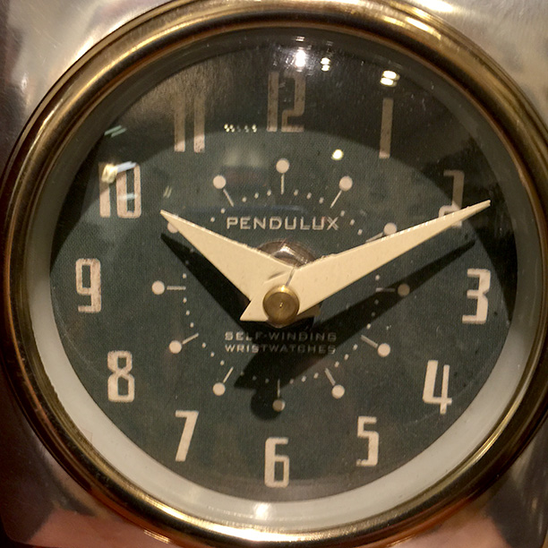
Using my font Hyperspace Race as a template, I was able to get the basic alphabets constructed in short order, then rebuilt certain letters from scratch, like this lovely 4 from the clock face above.
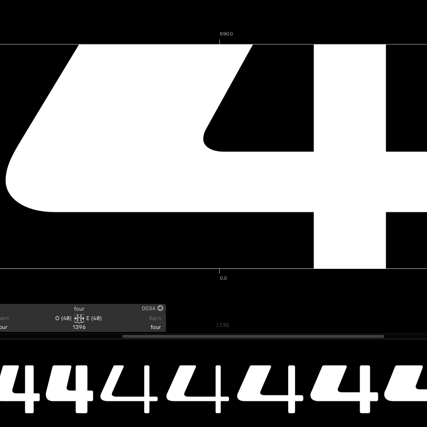
At the end, I gave the whole thing slightly rounded corners, which I thought added to the “vintage” look I was trying to capture.
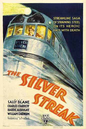
The last — and often most challenging — part of creating a font is figuring out what the heck to name it. “Zephyr” was off the table, but “Silver” seemed like a good first word. I wrote down a bunch of options until hitting upon this poster for the 1934 movie “The Silver Streak”, starring the Zephyr train — perfect!
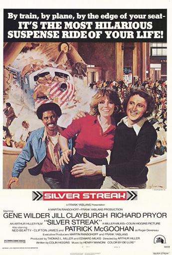
The 1976 remake with Richard Pryor and Gene Wilder has a pretty neat logo too… another future font?
Thanks for reading, and keep an eye out for Silver Streak next week!
