Lately I’ve been on an epic fontsploration of the signs, letters & historic type of Goleta, the community just north of Santa Barbara, for a font I’ve been wanting to make since long before I started Swell Type.
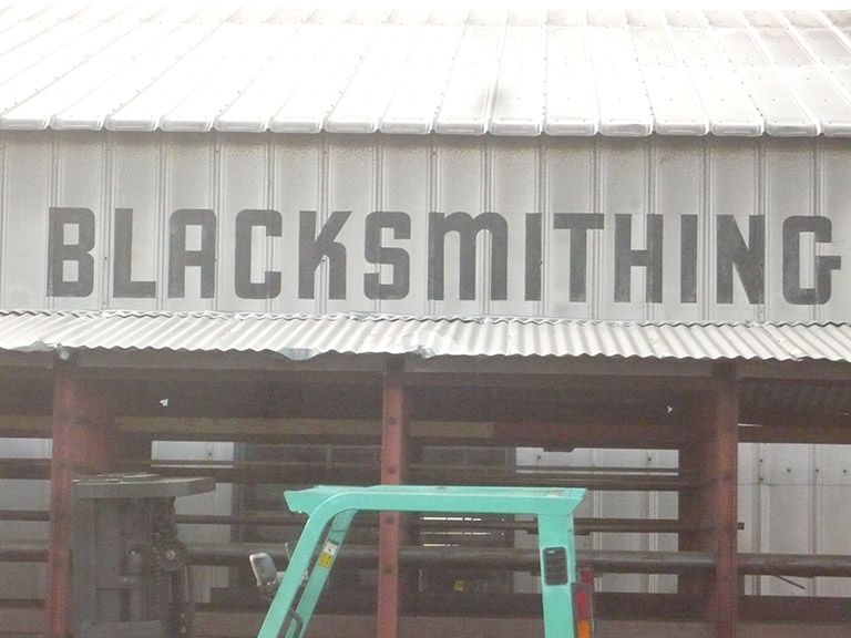
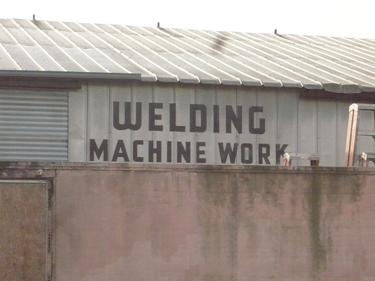
Way back in 2008, I snapped these pictures of some wonderful painted block lettering on the side of a warehouse just a block off the main street.
According to Goleta History, the building was erected in the 1940s, and you can see the lettering has been there from the start! Amazing that it was never removed or painted over as it changed hands over the years.

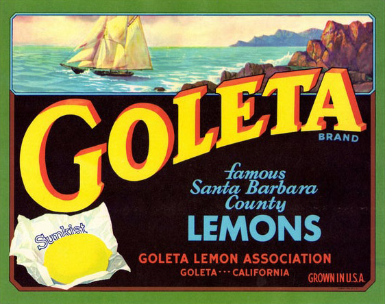
Goleta’s nickname is “The Goodland”, which comes from its years as a fruit-growing region. And wonderful things still come from the Goodland, like Deckers shoes and Flir cameras and Seymour Duncan guitar pickups!
I generally think of Goleta as a suburban area where my kids go to school and play soccer, and we hit the big box stores on the weekend. While Santa Barbara is cute and charming, Goleta is hard-working and no-nonsense. Get in, get your toilet paper and trail mix and Ugg boots, and see ya later.
So GOODLAND seems like a great name for this sturdy, no-frills style. And it incorporates the G from “blacksmithing” with its unusual sticky-out bit, which along with the funky angled K, can set it apart from the many, many versions of this style of lettering (and fonts based on it) that I’ve seen.
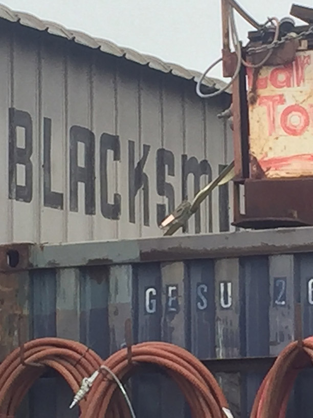
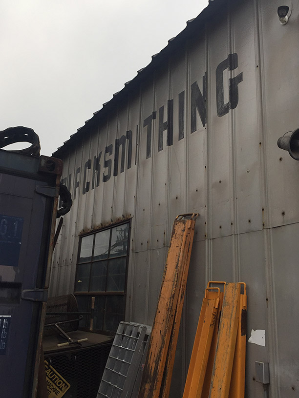
My 2008 phone pictures were pretty lo-res, so I went back to get some better shots. While the letters are still intact, now they’re blocked by piles of stuff. Disgrace!
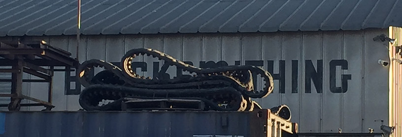
The building is now home to a construction equipment rental shop. So I went in, mumbled something about maybe needing to rent a front-end loader soon, climbed around the tractors and tried to get decent pictures of all the letters.
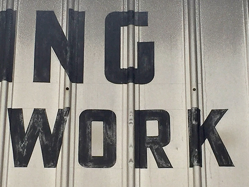
The letters are still in great shape. Lead-based paint may kill you, kids, but it lasts!
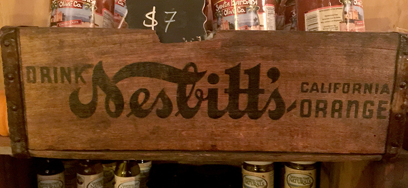
The next step is to dig into my vast folders of reference pix for similar styles. I found this shot of an orange crate with a matching round-topped A and N (but sticky-IN G) that I’d taken a mere block away, at my friend Anne’s Santa Barbara Gift Baskets shop (also housed in a cool old warehouse).
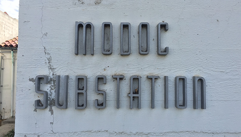
The lovely metal letters below adorn an otherwise nondescript concrete building just off State Street in downtown Santa Barbara. They’re thinner and a bit fancier, but share a lot of the same structure, especially the rounded A, M, and N, and straight across S.
I traced a few letters of the BLACKSMITH sign in Illustrator, and decided to bring them into Glyphs to build the rest.

The great thing about making geometric-shaped fonts is that a few letters can quickly be used to form others: rotated A becomes U, W and Y, G can become C, O and S, and so on..
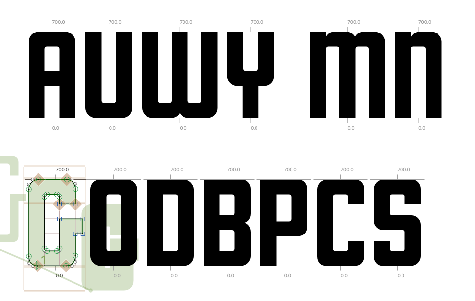
And there we go!

I made a curve-topped N to match the M, but look back — the original sign has a diagonal-line N! IT MAKES NO SENSE. Should it have a curved-leg R like the orange crate, or straight-legged to mirror K?

Ahhh, I’ll decide later, or better yet, make ’em Opentype alternates so you can decide. Opentype features are wonderful for relieving us designers of having to make the tough decisions.
After finishing the bold alphabet, I duplicated it and thinned and narrowed it like “Modoc Substation”.

Then duplicated it again to make a version as heavy and thick as it could go.
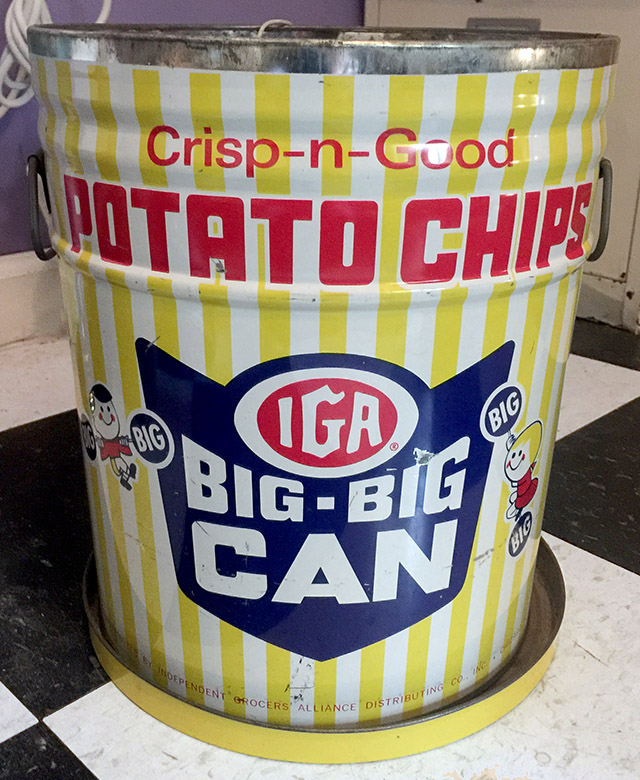
I noticed it looked a lot like this potato chip can that I took from my grandmother’s house in Illinois, and use as the trashcan in my office.
See, Dad? There was a reason I needed to haul it all the way to California. Fonts.
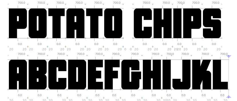
Most of the letters adjust easily, but maintaining the angle and connection point of that crazy K is tricky! I think I’m getting it…

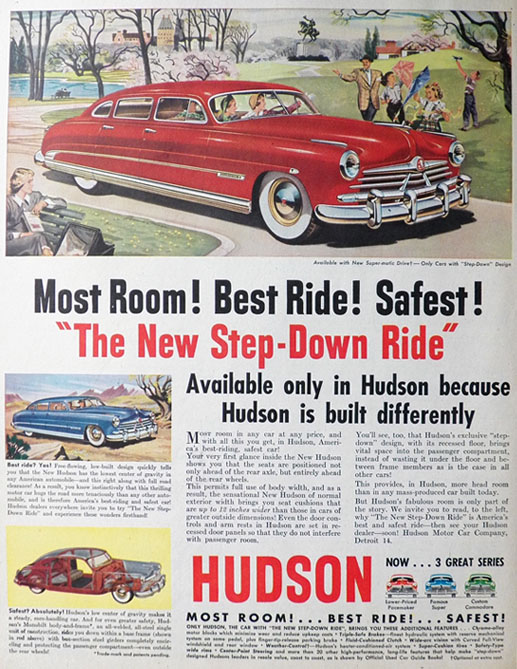
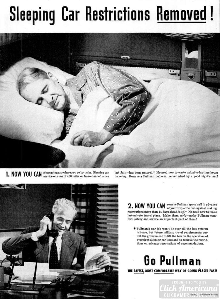
The uppercase is coming along, now how about lowercase? Diving back into those reference folders, I found some 1940s and 50s car and travel ads…
This title screen from a 1950s Perry Mason TV show…
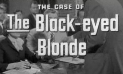
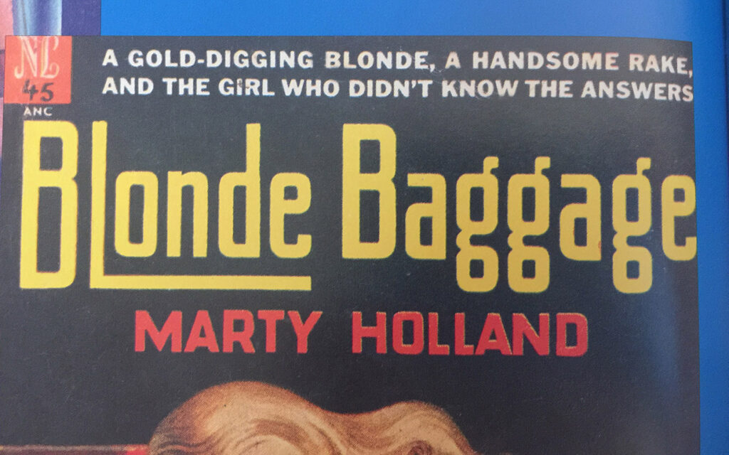
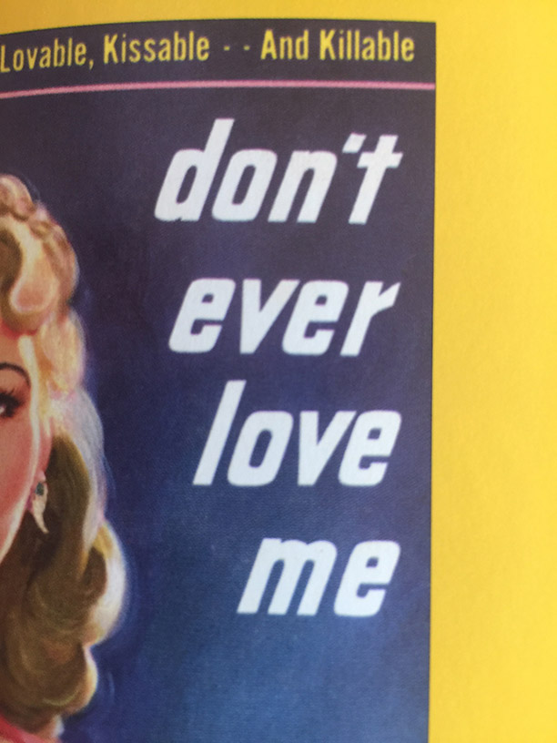
… and two pulp book covers which provided wonderfully unusual takes on g and r!
Again, many lowercase letters can be made by scaling and tweaking the uppercase, then the rest are constructed from those pieces and parts.
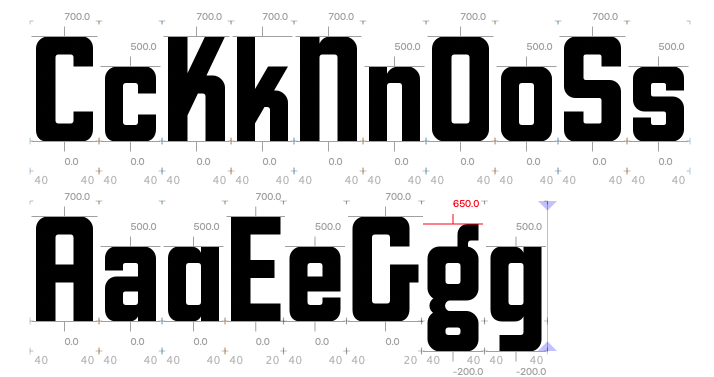
Two possibilities for g and a… which to include?

You let me know. Meantime, I’ll be building the rest of the weights and widths…
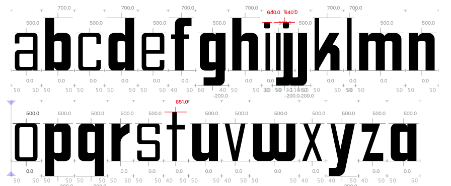
Lots to do! Happy new year!
