Ever since I was a kid, I’ve been a fan of this sharp sans-serif font that I often saw on ticket stubs, newspaper ads and magazine covers from the 1940s, 50s and 60s:
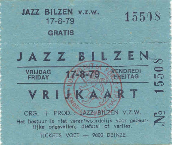
It was so cool and unique, with the sharp points on A & V, and skinny crossbars on Z & e.
Even when I became a professional graphic designer, and began to recognize fonts, I still never ID’ed this quirky old one. It wasn’t Futura, it wasn’t quite Gill Sans, and it wasn’t Kabel…
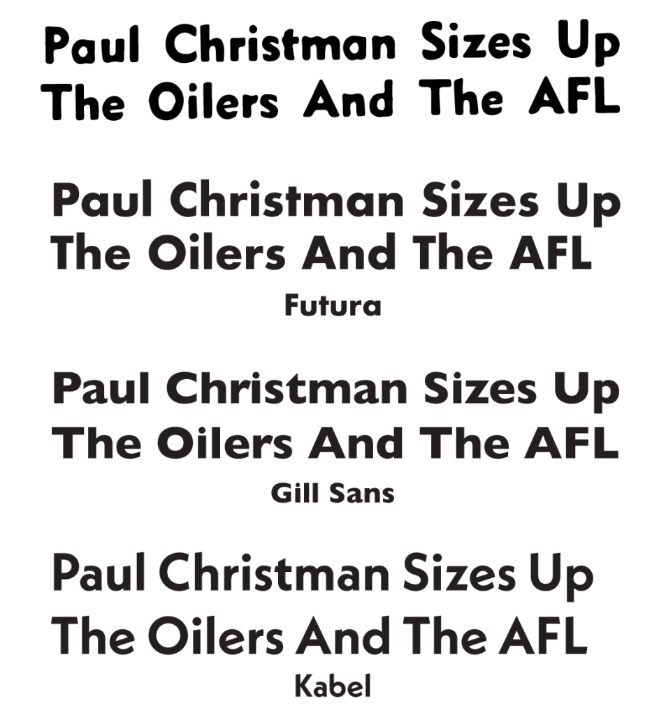
…and whatever it was, why wasn’t it available digitally, like these other fonts?
I kept images of the mystery font in my folders of font ideas, but had nowhere near enough samples to re-create a full alphabet.
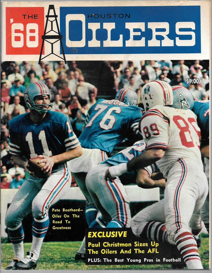
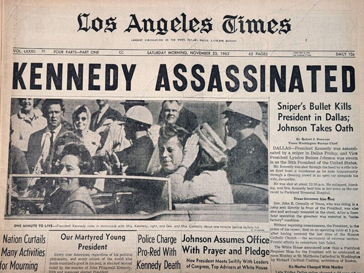
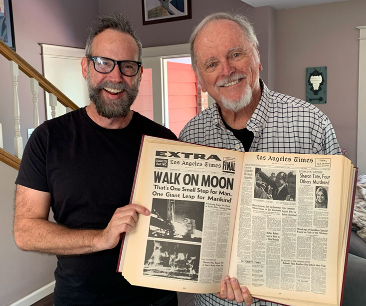
Then a few years ago, I was over at my friend Brian’s house. He had brought out a bunch of old L.A. Times newspapers he’d kept from the 1969 moon landing, which was then celebrating its 50th anniversary:
As a big fan of the space program, Brian had saved a bunch of Times front pages, and even drove to Florida with his girlfriend to watch the Apollo 11 rocket launch at Cape Canaveral! They happened to speak to an L.A. Times reporter covering the launch, and were quoted on the front page the next day as “Mr. and Mrs.”… much to the confusion of his mother back in Los Angeles…!
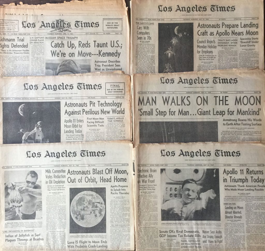
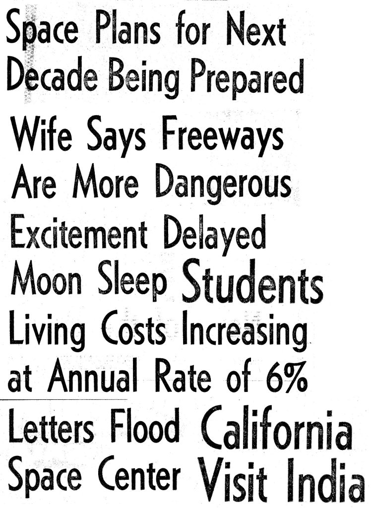
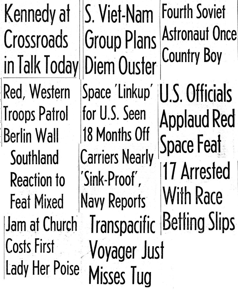
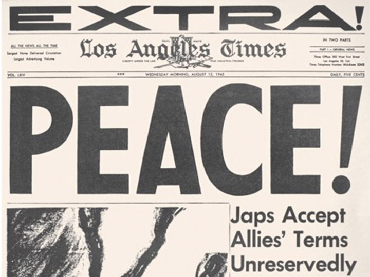
As a font nerd, the first thing I saw on the papers was this gorgeous headline font, with its swooping art-deco curves, and sharp angles on the corners and ends:
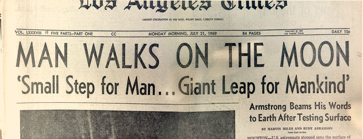
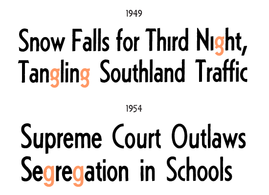
And then, when I looked closer, I realized… the subhead was in my mystery font!
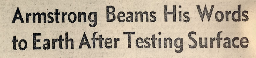
Brian graciously let me borrow his precious papers, and I carefully unfolded and scanned them to collect as many letters as I could find of the subhead font, as well as the tall headlines and tiny photo captions.
Eventually, I learned that the mystery font was named “Metro”, originally designed in 1929.
Which also meant that, alas, digital fonts indeed already existed.
But what didn’t exist…yet… was a version with all the delightful grunginess and imperfection of ink on old newsprint!
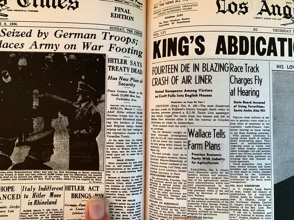
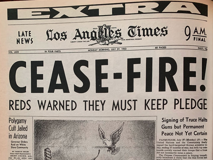
Plus the two tall headline styles were — as far as I can tell — exclusive to the LA Times:
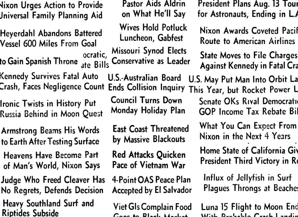
Even after scanning Brian’s papers, I was still missing a lot of letters; particularly Js, Qs, Xs and Zs, and most of the punctuation and symbols needed to complete the fonts.
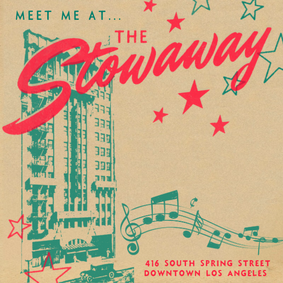
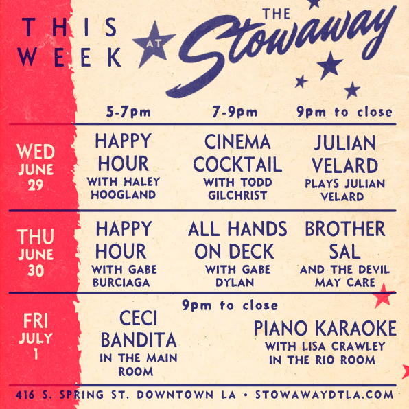
So I abandoned the project for a while. Though the partially finished fonts ended up working perfectly in my designs for a jazz age-themed nightclub in downtown L.A.:
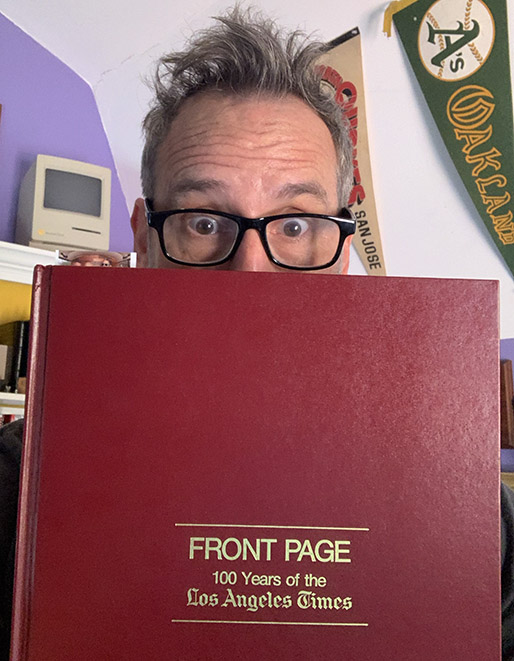
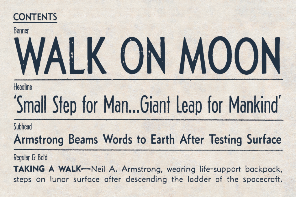
This year, I decided to dig in and finally complete the fonts. So I started searching the web for images of L.A. Times newspapers, when I discovered this book!
I was delighted to discover that Js, Qs, Xs and Zs abounded within, as Juries were Quizzed, Nazis Blitzkrieged, and Nixon… Nixoned.
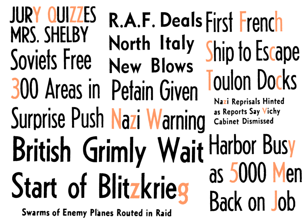
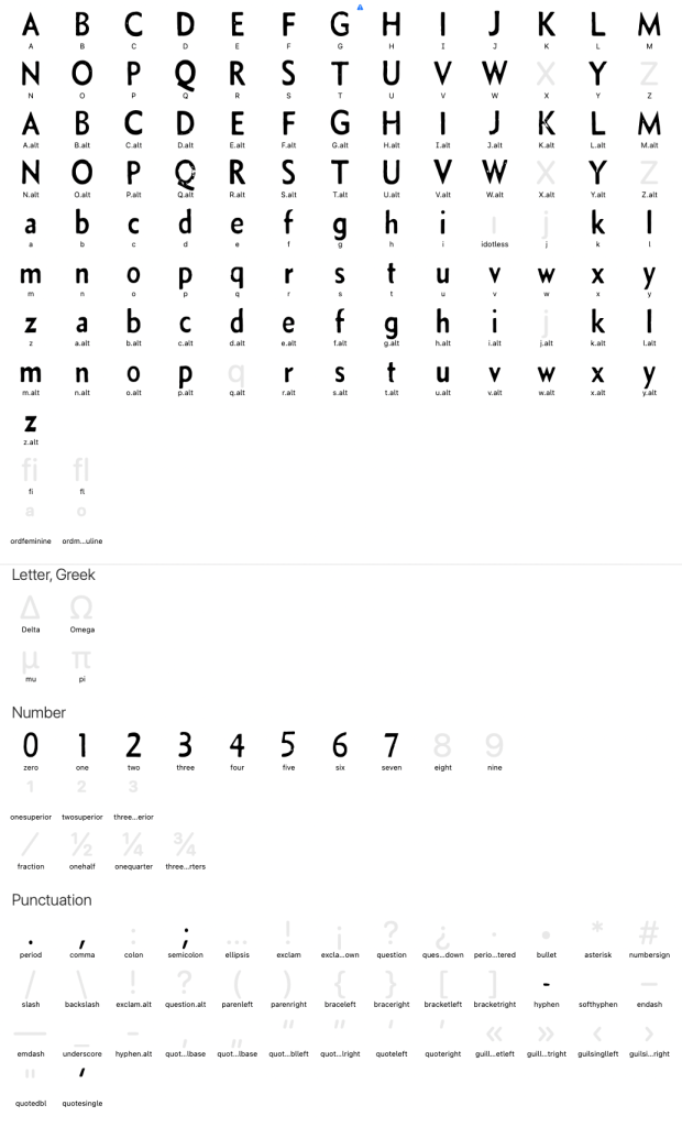
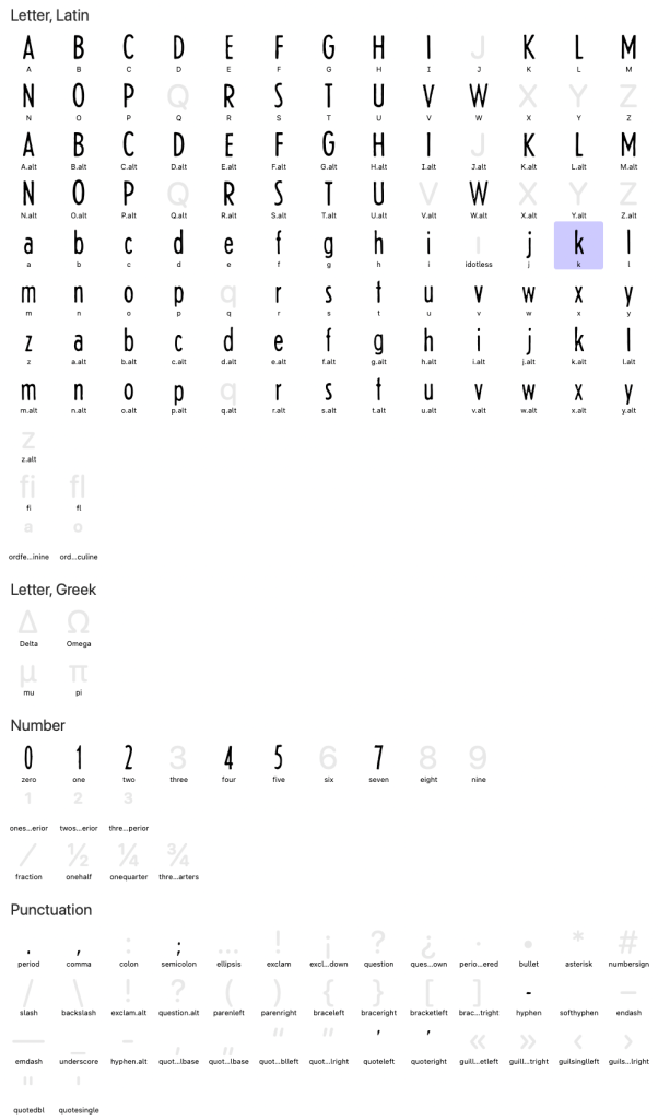
I also found nifty alternate versions of letters a & g, and some of the numbers:
The book also showed me when the fonts were used, from their radical 1936 debut:
…to their unfortunate 1980 retirement (for Times Roman?!? Blech.):
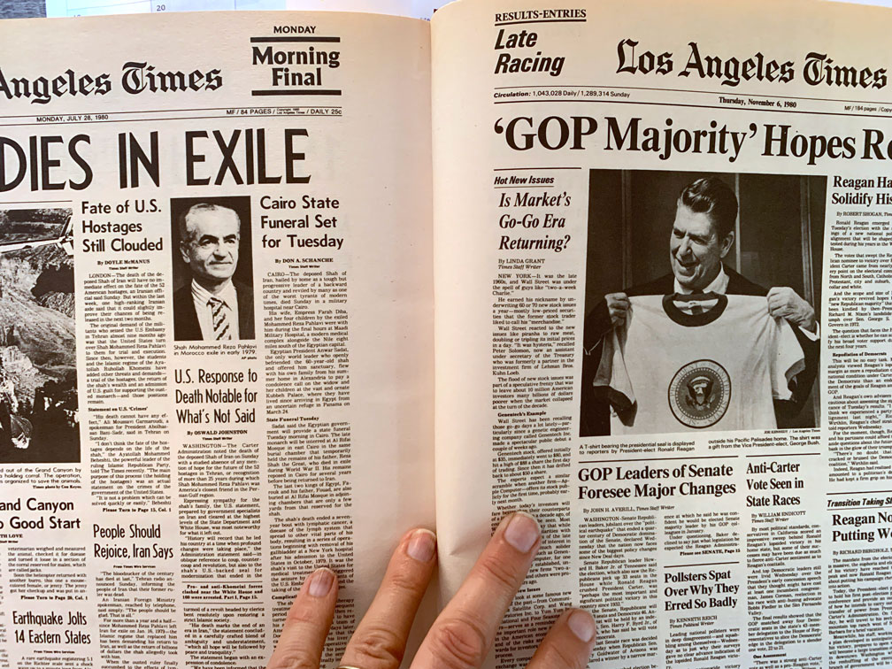
Okay, the look had probably become a bit dated by the late ’70s, but still, 45 years for a design system is an impressive run!
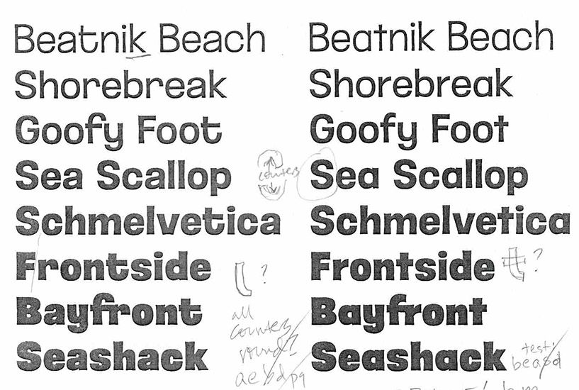
With all of this source material, I was able to create five weights, each with three versions of every letter and two versions of every number, which automatically cycle while you type:
As the fonts neared completion, I asked Brian why — as a non-font-obsessed graphic designer like me — what newspapers in particular meant to him, to have continued to keep them for so many years. It turns out Space wasn’t the only reason…
“When I was 12, my father gave me a Huckleberry Finn first edition. It had this gorgeous lettering on the cover and spine. And I remember opening it up, and there was one of those transparent onion-skin papers, and underneath that, a detailed engraving of Huck and Jim paddling down the river. I remember thinking, ‘this thing is BEAUTIFUL!’
“I realized that books aren’t just about the stories inside, but are objects to appreciate in and of themselves. So I began collecting books, and eventually newspapers too, especially when there was a big headline across the top, which meant something important had happened that day.”
“But unlike books, newspapers aren’t meant to last. Sometimes if I pick up my LA Times off the driveway at the end of the day, I can see it’s already begun to yellow… and if it gets wet, forget it!”
Hopefully my finished Newshound fonts forever capture and preserve that wonderful look, feel — and even the smell — of ink on old newsprint!