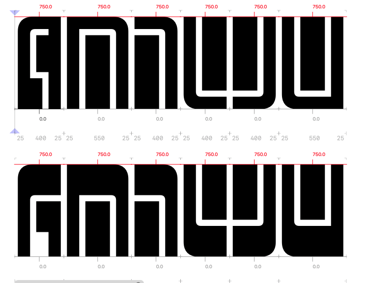
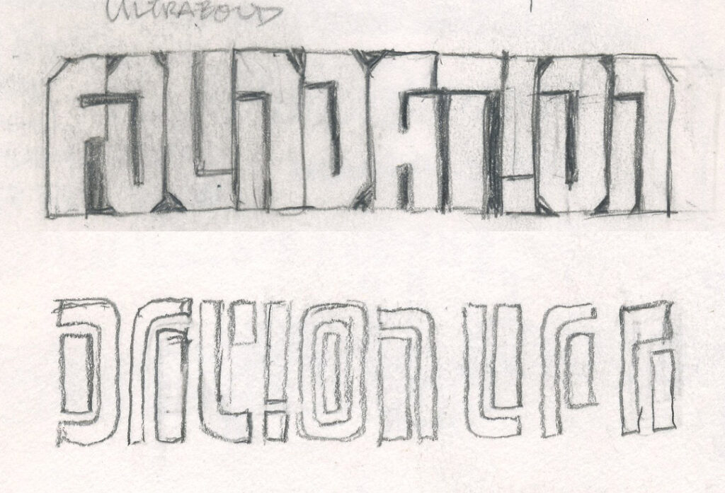
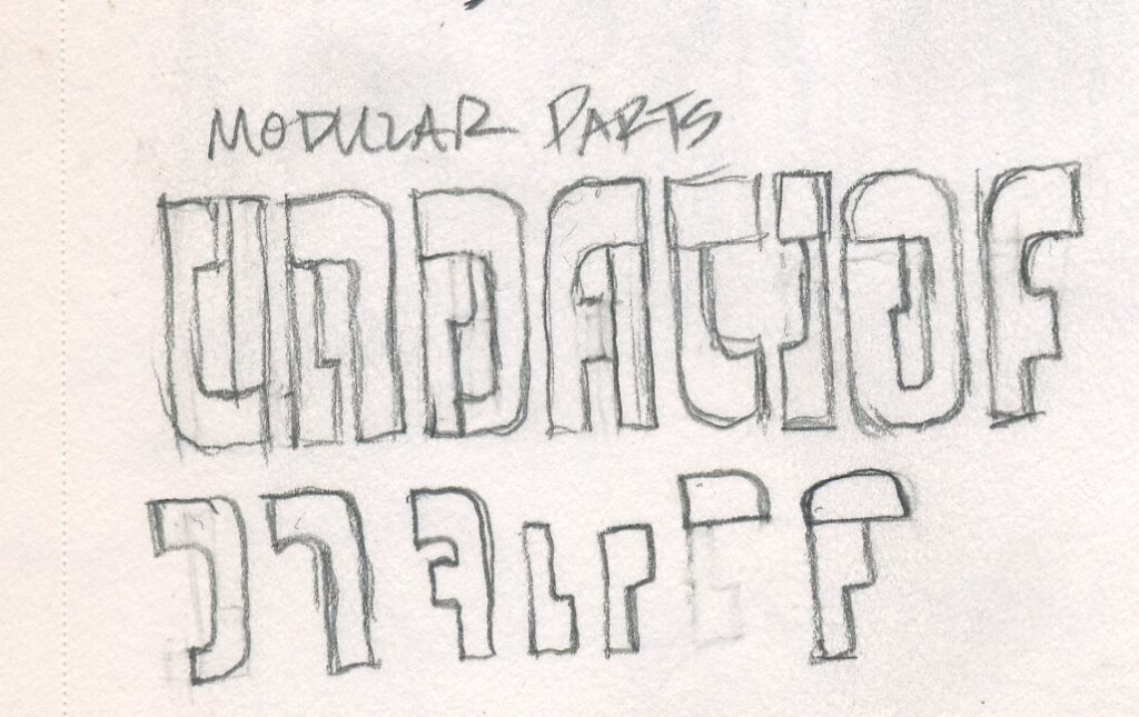
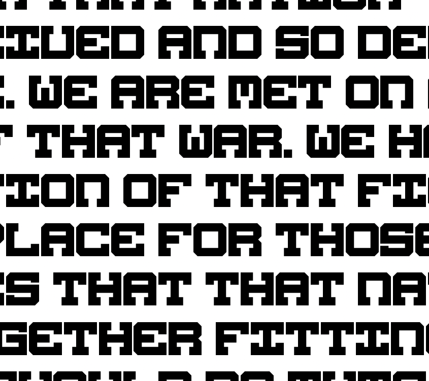
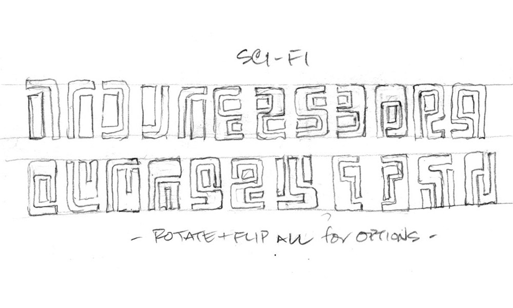
Here’s a concept i’ve been kicking around for years: to design a few basic shapes that can be rotated and flipped around to create all of the letters and numbers.
The results are kinda primitive & kinda sci-fi, and I end up coming back to it whenever I’m sketching designs for a sci-fi logo.
None of these logos have ever been chosen, so perhaps it’s actually a bad idea for a font. But this is a good week for bad ideas! Off I go.
I like to work with groups of similarly-shaped letters…
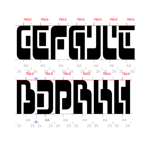
This timelapse zeroes in on my fine-tuning of B D P R K and H. So many options…
Two sets of A N U V? Which is better?
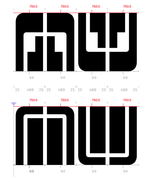
Perhaps neither? Here’s where it ended up for today. I put them in the upper and lowercase, so you can see which you like best!
